Project Of The Week
Architecture
Once a Cold House With a Tricky Sewer Line, Now a Modern Beauty
This run-down '80s brick house in Hobart ached for warmth and a better layout – see an architect's thoughtful response

In this Q&A series, we turn the spotlight on one thought-provoking renovation, redesign or new build each week. Here, Rosa Douramanis, architect and principal at Biotope Architecture and Interiors, reveals how she overcame the constraints of a tight budget and an immovable sewer line in a renovation to a Hobart home. The redesign ushered light, warmth and connected living spaces into the previously run-down home for a pair of retirees.
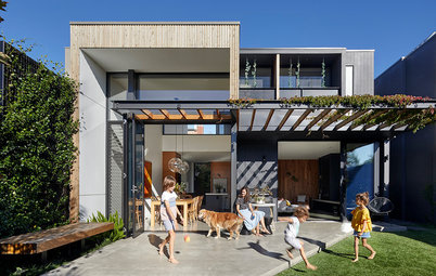
The original facade.
What was the house like originally?
A 1980s single-storey, brick house.
Inspired to renovate? Find an architecture near you on Houzz
What was the house like originally?
A 1980s single-storey, brick house.
Inspired to renovate? Find an architecture near you on Houzz
What state was it in?
Cold, run-down and with limited natural light – it was clearly in need of a renovation.
Cold, run-down and with limited natural light – it was clearly in need of a renovation.
Original floor plan.
Proposed floor plan.
What wasn’t working for the client?
The house did not have a defined entry and the interior felt cold.
Also, the kitchen and dining areas were closed off from each other, and the living area was rarely used as it was isolated from the kitchen and dining room.
What wasn’t working for the client?
The house did not have a defined entry and the interior felt cold.
Also, the kitchen and dining areas were closed off from each other, and the living area was rarely used as it was isolated from the kitchen and dining room.
What was your brief?
- Create a warm, sun-filled house with a strong connection to the garden.
- Improve flow between the entry and living spaces.
- Create an open-plan kitchen/living/dining area with wall space in the living area for generous joinery storage, a computer nook, and a statement heater.
- Low-maintenance finishes and layout.
What was your scope of work?
The design was developed to work with the client’s budget constraints. Two existing bedrooms and the existing bathroom were excluded from the renovation to reduce costs, with the majority of the budget dedicated to the new addition and renovating other parts of the home.
The design was developed to work with the client’s budget constraints. Two existing bedrooms and the existing bathroom were excluded from the renovation to reduce costs, with the majority of the budget dedicated to the new addition and renovating other parts of the home.
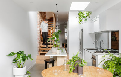
How did you reorganise the internal spaces?
We converted the original living area, which was awkwardly separated from the other living/dining spaces, into a new main bedroom with an ensuite.
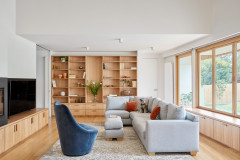
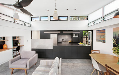
We then grouped the living/kitchen/dining spaces together, defined through a series of joinery spines, window seats and nooks.
One of the original four bedrooms, which is located beside the kitchen, was converted into a new laundry, with access to the back deck.
We converted the original living area, which was awkwardly separated from the other living/dining spaces, into a new main bedroom with an ensuite.
We then grouped the living/kitchen/dining spaces together, defined through a series of joinery spines, window seats and nooks.
One of the original four bedrooms, which is located beside the kitchen, was converted into a new laundry, with access to the back deck.
The original kitchen and laundry.
Did you add to the footprint?
Yes – by around 40 square metres in the new living area.
This project was mainly a renovation with a small new living space addition. The renovation work included reorganising spaces and repurposing under-utilised areas for new uses, while staying within much of the existing footprint.
What timber did you use?
Solid and veneer Tasmanian oak with a clear finish, and blackbutt for the front and back doors and the exterior cladding,
Why do these timber touches work so well here?
Timber inside creates a warm environment and reduces glare from light coming in through the large new window and door openings.
Clear-finish timber as external cladding sits beautifully alongside the face brickwork.
What are the main sustainable features?
- The use of the existing building fabric to reorganise and repurpose spaces, which meant only a small addition was required.
- Where large openings were added, the existing brickwork was salvaged and reused to patch the modified walls.
- The use of renewable timber products and low-VOC (volatile organic compound) paint to boost indoor air quality.
- Passive solar design principles.
- All the excavation has been retained on-site for the owners to rebuild garden beds and create new and raised garden areas.
The original closed-off dining room.
What was gained with the new works?
What was gained with the new works?
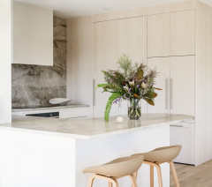
- A new open-plan kitchen/dining/living area, with a courtyard accessed from the dining area.
- A more functional laundry and pantry.
- A new main bedroom with an ensuite.
- A reorganised second bedroom with a new door location.
- A welcoming entry area.
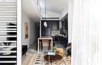
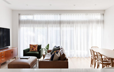
What was your thinking behind the colours and materials?
The idea behind the palette was to create a feeling of spaciousness through the minimal use of colour, while reducing glare.
The restrained colour and materials palette of neutral tones and oak also helps frame the view and puts the focus on the outdoors.
The idea behind the palette was to create a feeling of spaciousness through the minimal use of colour, while reducing glare.
The restrained colour and materials palette of neutral tones and oak also helps frame the view and puts the focus on the outdoors.
What look and feel did you want to create?
Contemporary with a sense of Scandinavian minimalism.
We wanted the spaces to look and feel warm and inviting, with beautiful and practical neutral colours, natural textures and minimal clutter.
Contemporary with a sense of Scandinavian minimalism.
We wanted the spaces to look and feel warm and inviting, with beautiful and practical neutral colours, natural textures and minimal clutter.
Where did most of your AU$600,000 budget go?
On the new addition and renovating and reorganising the internal spaces.
On the new addition and renovating and reorganising the internal spaces.
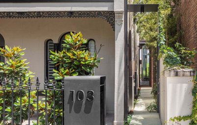
What are the defining features of the house now?
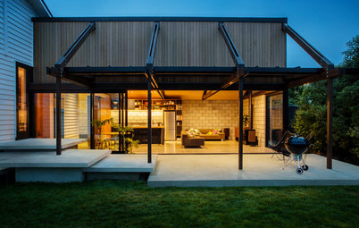
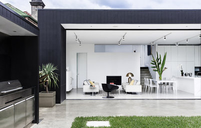
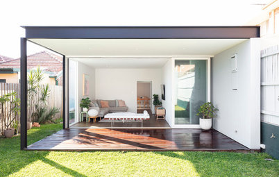
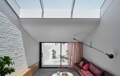
- The masonry facade. This runs past the entry and dining area to create courtyards and defines the new entrance and deck off the dining space.
- Large openings that frame garden views, in particular the window seats.
- A double-sided Cheminees Philippe fireplace between the dining and living areas.
- The spine of joinery for storage.
- Full-height, timber-framed glazed internal sliding doors.
- A hidden door between the laundry and kitchen.
- A highly functional laundry with an ironing station.
What challenges did you work around?
Designing the new extension to work within the constraints of the in-ground services infrastructure, in particular an immovable sewer line, while creating the spacious living/dining/kitchen the client was after.
Designing the new extension to work within the constraints of the in-ground services infrastructure, in particular an immovable sewer line, while creating the spacious living/dining/kitchen the client was after.
The budget added constraints to the project, but also brought out new opportunities of limiting the extension only to the front of the house.
The low ceilings in the existing 1980s house were used as a datum for the new extension so the spaces and scale are unified.
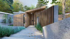
The front entrance.
Why do you think the house works so well now?
Extending the masonry facade past the entrance and dining areas works well because it creates courtyards and defines the new entry area and deck, which flows off the dining space.
Internally, the reorganisation of the spatial planning creates a better flow between spaces.
Materials and finishes
- Existing bricks.
- New solid Tasmanian oak flooring in the new addition (the existing floorboards were restored).
- Tasmanian oak veneer on the custom joinery.
- Caesarstone Fresh Concrete benchtops in the kitchen.
- Atlas Concorde Boost matt finish tiles in Pearl in the bathroom.
The new main bedroom.
Fixtures
Fixtures
- Bespoke blackbutt-framed glazed exterior doors.
- AWS black steel-framed windows.
- Studio Bagno Lust freestanding bath.
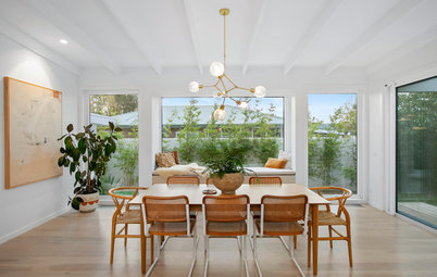
Furniture
- GlobeWest Felix sofa.
- Temple & Webster Mason dining table.
- Inartisan Larah dining chairs.
- Coast to Coast Home Teddy armchairs in the main bedroom.
Paint colours
Your turn
What’s your favourite feature in this redesign? Tell us in the Comments below. And don’t forget to save these images, like this story and join the conversation.
More
Keen to see another thoughtful renovation? Check out this Melbourne Houzz: An Architect’s Post-Pandemic Family Home
- Dulux Whisper White on the exterior.
- Haymes Paint Warm Olive on the interior walls.
Your turn
What’s your favourite feature in this redesign? Tell us in the Comments below. And don’t forget to save these images, like this story and join the conversation.
More
Keen to see another thoughtful renovation? Check out this Melbourne Houzz: An Architect’s Post-Pandemic Family Home
Who lives here: A retired couple
Location: Hobart, Tasmania
House size before works: 190 square metres
House size after works: 230 square metres
Bedrooms and bathrooms before works: Four bedrooms and one bathroom
Bedrooms and bathrooms after works: Four bedrooms and two bathrooms (the home’s study became the new ensuite)
Budget: Around AU$600,000
Architecture and interior design: Biotope Architecture and Interiors
Builder: Delaney and Co
Joinery: Custom Cabinets
Styling: Shift Property Styling