Project Of The Week
Architecture
Renovating
An Upside-Down Solution for a Skinny, Rundown Terrace
Inverting this home's traditional layout gave the living areas the light, ventilation and views they so badly needed

In this Q&A series, we turn the spotlight on one thought-provoking renovation or redesign each week. Here, Peter Knights, co-director at Taylor Knights, takes us through the intricate reworking of a neglected Victorian terrace in Melbourne. What was once a four-bedroom, two-bathroom home is now an inventive and beautifully detailed three-bedroom, two-bathroom abode that coolly blends old and new.
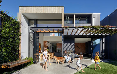
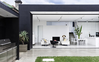
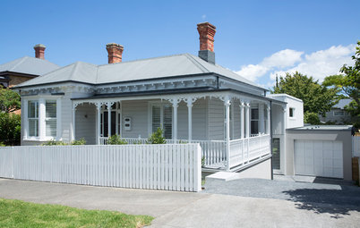
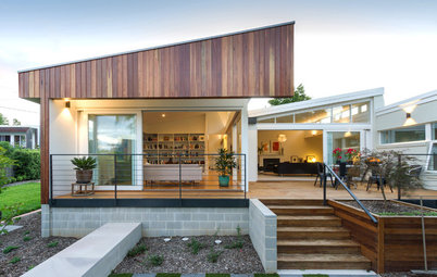
The renovated facade
Gained
Gained
- A new, second living space (the sunken lounge on the first floor).
- Makeovers to the study/bedroom and formal living room at the front of the original terrace (which swapped positions on the ground and first floors).
- A new terrace and roof deck.
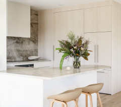
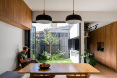
- A new open-plan kitchen/living/dining room.
- A new master bedroom and ensuite with generous storage.
- A new powder room.
- A lock-up carport.
The facade before works
What was the house like originally?
A tired four-bedroom, two-bathroom Victorian terrace locked on both sides by double-height party walls.
Ready to take the plunge? Find a local architect on Houzz and discuss your plans
What was the house like originally?
A tired four-bedroom, two-bathroom Victorian terrace locked on both sides by double-height party walls.
Ready to take the plunge? Find a local architect on Houzz and discuss your plans
The rear of the house before works
What wasn’t working about the original house?
It was dark, run-down, poorly ventilated and had no access to outdoor spaces.
The house didn’t work for everyday living or entertaining, and there was no appreciation in the design for the home’s location – for example, you couldn’t see the city lights from anywhere in the house.
Also, no passive-design principles had been employed.
The first floor before works
What was your brief?
What was your brief?
- To transform the space into a contemporary home that was refined and aspirational, while retaining the home’s heritage features and frontage.
- To incorporate passive design principles, such as heat stack, cross ventilation and good passive heating.
The dining room before works
What were the client’s must-haves?
What were the client’s must-haves?
- Despite the small block, the house needed to have a spacious feel and a fantastic connection with the environment.
- Create an inspirational contemporary home at the rear.
- Incorporate passive design principles so the house would be comfortable year-round.
The kitchen before works
What problem or limitation did this project address?
Typical of most terrace projects, the task here involved tackling a deep, narrow site, locked on both sides by double-height party walls. The house was inherently plagued with issues of darkness, damp and poor ventilation.
Our approach quickly focused on injecting light deep into the footprint of the home through a series of light-catching volumes and openings.
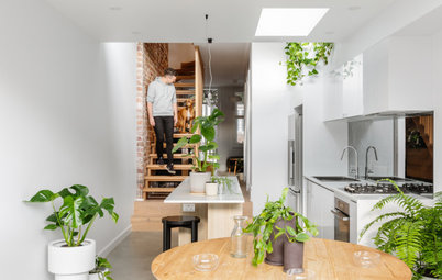
In addition, the interior spaces have been reconsidered using the principles of ‘inverted living’. We flipped the original arrangement by lifting the living spaces onto the first floor to make the best use of the improved light access, natural ventilation and valuable aspects to the north and south.
What problem or limitation did this project address?
Typical of most terrace projects, the task here involved tackling a deep, narrow site, locked on both sides by double-height party walls. The house was inherently plagued with issues of darkness, damp and poor ventilation.
Our approach quickly focused on injecting light deep into the footprint of the home through a series of light-catching volumes and openings.
In addition, the interior spaces have been reconsidered using the principles of ‘inverted living’. We flipped the original arrangement by lifting the living spaces onto the first floor to make the best use of the improved light access, natural ventilation and valuable aspects to the north and south.
The original floor plan
What exactly did you do?
We kept the front rooms on the ground and first floors, and the original location of the stairs.
The positions of the living rooms and the bedrooms were swapped to give the living areas access to natural light, ventilation, and beautiful views of the city and greenery. We moved the living areas to the first floor and the bedrooms to the ground floor.
The two party walls and the existing heritage roof and chimneys had to be retained as the property has a heritage overlay. Together with the client, we liked the heritage aspect.
We cut into the existing heritage room and angled it to make way for a large, north-facing highlight window or skylight. However, you get no hint of this from the street – the original roof and facade appear to be completely restored.
A section after works
What challenges did you have to work around?
A small and narrow site meant there was very little site access. Everything had to be custom-made and built by hand on-site.
What challenges did you have to work around?
A small and narrow site meant there was very little site access. Everything had to be custom-made and built by hand on-site.
The ground floor after works
How do the old and new parts of the house sit beside each other?
The boundaries between new and old have been blurred.
We’ve used the same traditional Flemish-bond brickwork in the new extension as the existing house. We wrapped the entire perimeter extension with this brick pattern and painted it white so the building form would be cohesive and unified.
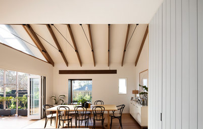
The first floor and roof terrace after works
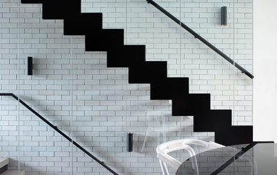
The old and new parts blend quite seamlessly. An example of this is in the heritage stair runner and the new perforated-steel stairs, which share the same width. The material language is very different, but the proportions are the same.
The old and new parts blend quite seamlessly. An example of this is in the heritage stair runner and the new perforated-steel stairs, which share the same width. The material language is very different, but the proportions are the same.
The dining table designed by Taylor Knights in Signorino Tile Gallery ice green marble
What was the budget?
$1.2 million.
Where did most of it go?
A fair chunk went into the structure and restoration.
What was the budget?
$1.2 million.
Where did most of it go?
A fair chunk went into the structure and restoration.
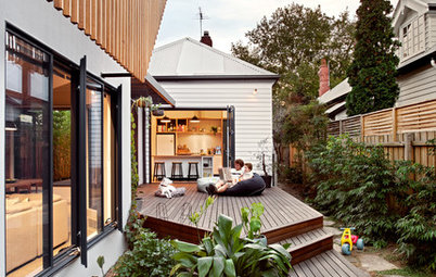
Why did you choose crazy paving for the sunken living room?
We wanted a material that would work just as well inside as out in order to create a seamless threshold between the two areas.
Because the site is so small, it was important to make the space feel bigger at every opportunity. Using one continuous material makes the room feel twice as big as it really is.
The sunken living room leads to the terrace
Tell us about the super-size skylight in the sunken living room
This space is all about slowing down and appreciating the environment (for example, there is no television here). We wanted the clients to be able to lie back and watch the clouds and sky, have conversations, read a book or play with their pets here.
The large skylight brings in an abundance of light creating an indoor/outdoor feeling – something that is so important for the Melbourne climate.
Tell us about the curved concrete ceiling
We wanted a material that was both structurally functional for the roof deck above and also poetically beautiful. We wanted the ceiling surface to be rough and organic to offset the highly refined detailing elsewhere.
The concrete is also a beautiful material to catch light; the imperfect becomes perfect as it celebrates the movement of the sun throughout the day.
How was the concrete ceiling made?
The concrete was poured on-site. We ordered a large five-metre length section of rough-sawn barge board as the formwork. We then proceeded to add spacer and packers between the planks in order to amplify the timber grain, and add variety and depth to the ceiling.
Once the formwork was in place (which was like a piece of artwork) and inspected, the concrete was applied. The concrete was sprayed in using a ‘shotcrete’ process.
Mineral Matter IX artwork: Brooke Holm
Why do you think this house works so well?
Because of the level of craftmanship and care taken by all parties involved. Every detail has been meticulously considered and worked through, all the way down to the built-in furniture, custom-designed joinery handles and custom dining table.
Why do you think this house works so well?
Because of the level of craftmanship and care taken by all parties involved. Every detail has been meticulously considered and worked through, all the way down to the built-in furniture, custom-designed joinery handles and custom dining table.
The restored, original staircase on the ground floor
The new staircase leading to the roof terrace shares the same proportions as the original stairs, creating a sense of connection between the two
The roof terrace; landscape plant selection: Ben Scott Garden Design; landscaping: Mack Landscape Management
Tell us about the roof terrace
We wanted the built-in seating to wrap around a tree on the roof deck and offer up different ways to utilise the space: as somewhere to sit and chat, relax, sunbathe or entertain friends.
Having highly functional and private open space is so important for inner-city dwellings. The space is meant for the everyday as well as for entertaining. We placed a rooftop barbecue, tap, sink and bar fridge here so that everything is covered.
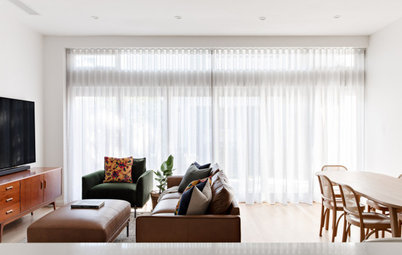
The formal living room
Interior materials palette
Interior materials palette
- Tongue n Groove chevron parquet floor.
- Eco Outdoor Endicott crazy paving.
- Corian in matt white to the white kitchen benchtops.
- Black Zimbabwe compact stone with a leathered finish to the black island unit.
- George Fethers Oak Crown timber veneer to the bathroom joinery.
- Artedomus Inax Biyusai terrazzo tile with a honed finish to bathroom walls.
- Artedomus Elba Stone to kitchen splashback and bathroom benchtops.
- Warwick Fabrics Burano in Rose to curtain in sunken lounge.
- Perforated metal stairs custom made by Tescher Forge and finished in Dulux Natural White.
- Roof hatch by Gorter Group.
Exterior materials palette
- Recyled bricks laid in a Flemish-bond pattern with hit-and-miss detailing, and finished in Dulux Natural White.
- Built-in seating on roof deck clad in 32-millimetre ironbark with Cutek natural finish.
The new master bedroom
Interior paint colours
Exterior paint colours
Interior paint colours
- Dulux Natural White.
- Dulux Vintage green.
- Dulux Hauraki Gulf.
Exterior paint colours
- Dulux Natural White.
- Dulux Ferrodor Natural Grey.
The main bathroom
Key fittings
Key fittings
- Allied Maker Court Sconce wall lights.
- Euroluce Flos 265 large wall light in sunken lounge.
Your turn
Were you inspired by this contemporary reimagining of a traditional terrace? Tell us what you love about this redesign in the Comments, like this story, save the images and join the conversation.
More
Seeking inspiration for your own renovation? Don’t miss last week’s Project of the Week: A Neglected Victorian Villa Reborn as a Sustainable Family Home
Answers by Peter Knights of Taylor Knights
Who lives here: A young, design-savvy couple
Location: Fitzroy, Victoria
Size of the house originally: 171 square metres
Size of the house after works: 193 square metres
Size of the site: 128 square metres
Architect: Peter Knights, James Taylor and Julie Sloane at Taylor Knights
Builder: Dimpat
Engineer: R Bliem & Associates
Building surveyor: Stephen Fotia, Fotia Group
Construction, joinery and steelwork: Tescher Forge
Stylist: Ruth Welsby