

Put a Little Colour Into Your Dreams: Paint Your Bed
Pick a favourite hue and go to town – sleeping has never been so much fun!

More often than not, bed frames are a neutral colour – they have white, black or timber finishes that coordinate with nearly everything, but can lack charisma. Instead, consider using a bright colour to add personality and vitality to what is presumably the most frequently used piece of furniture you own. Here are some examples of beds in every colour of the rainbow – and how to get one of your own.
Orange
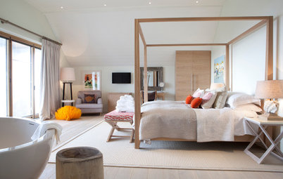
Orange is known as a power colour and is often associated with creativity and cheer. It is optimistic and uplifting – a perfect colour to wake up next to if you suffer from early-morning grogginess.
This pair of beds is painted a subdued orange reminiscent of a creamy summertime icy pole. It is still bright enough to convey orange, but with the right amount of milky softness to dampen any harshness inherent in a brighter, more intense orange. Surrounded primarily by neutrals on the walls and floor, the solid orange also highlights the voluptuous form and carved motifs of the bed frames.
Yellow
The colour yellow is associated with sunshine, making it probably the happiest of hues. This intensely pure yellow cottage-style bed adds freshness and a lively vibe to this girl’s bedroom. Although bright colours are often stereotyped as being for kids or uber-contemporary spaces only, this palette of yellow with pink and turquoise accents is at home in this traditional Michigan, US, holiday home, and would be equally welcoming in a bedroom for grown-ups.
Discover more ways to add yellow to your home
Green
Green is associated with good luck and money, as well as being the universal signal for “go”. The predominant colour of plant life, it evokes freshness and vitality while instilling a sense of calm.
This brilliant green painted wrought-iron bed is the lifeline of this Australian farmhouse bedroom. Imagine if it were painted a standard white – the bedroom wouldn’t have nearly the same charm.
Blue
The colour of the sky, blue is cited globally as the most popular colour. Blue is associated with adventure (going “into the wild blue yonder”), cleanliness as well as optimism, as expressed in Irving Berlin’s 1926 lyrics ‘blue skies smiling at me’ from the song Blue Skies.
It’s no wonder this cooling, serene colour makes its way into many bedrooms. This blue bobbin four-poster bed turns heads in this tropical-themed South Carolina, US, home. Surrounded by ethereal whites on the walls, floor and bedding, the blue visually pops.
Indigo
Dark blues, such as indigo, are affiliated with intuition and perception and are considered reserved and dignified.
Marisol Roman of Roman Interior Design shares that this indigo-hued sculptural headboard is actually a painted wall panel. The panelling wraps up to the ceiling to mirror the form of the bed below to give the perception of a canopy.
Violet
The colour purple historically symbolised nobility and opulence, because the dye was so rare and costly to extract – it was made by crushing the shells of thousands of shellfish. In 1856 the first synthetic purple dye, called mauveine, was created in a failed experiment to synthesise quinine. It became immediately popular.
Purple today still evokes a sense of luxury … and perhaps a touch of mystery. The boudoir is a befitting space for this magical colour. A monochromatic look, such as with the bed in this bedroom by Buckingham Interiors + Design, doesn’t need to be boring or overly matchy. The bed successfully includes a spectrum of purples – from the bluish violet of the bedskirt to the redder tones of the quilt and the brighter, more intense hue for the upholstered headboard.
7 BED-PAINTING TIPS
1. It’s best to paint your bed frame before it’s already assembled and in your bedroom with the mattress on top. Otherwise, you’ll want to ask for help in removing the mattress, disassembling the bed frame and moving it to a good spot for painting. The time required for this project will vary depending on how fast you work, the intricacy of your bed frame, what look you’re trying to achieve and how much prep work, if any, your frame requires. Three days is a solid time estimate, so plan on spending a few nights on the floor on your mattress.
If painting isn’t your strong suit, don’t worry, this project shouldn’t be too complicated; it’s an undertaking most will be able to handle. However, if this is not something you want to dive into or you don’t have any workspace, you could enlist a crafty friend or relative. Also, some professional painters do offer furniture painting services. The advantages of doing it yourself are that it will be economical and you’ll have a hand (yours, in fact) in determining how quickly the job is completed – not to mention the fun! A friend, relative or professional painter will likely do a quality job, but the turnaround time may not be as fast as you’d like.
2. For furniture it’s recommended to use a paint with a medium- to high-gloss sheen, depending on the look you are trying to achieve. It deters fingerprints, increases durability and allows for a cleanable and wipeable surface. High-gloss sheens are typically appropriate on contemporary furniture, whereas a semigloss is a safe go-to sheen for most other pieces.
3. For a distressed look, try milk or chalk paint, which doesn’t require any surface prep other than making sure it’s clean. If you are looking for an even, non-distressed application of paint, lightly sanding the surface with a medium- to fine-grit sandpaper, then priming it and sanding it again will create a good base for latex or emulsion paint. Be sure to remove any dust from sanding with a tack cloth after each step. Also, fill any holes or cracks before you start. Be sure to remove any decorative hardware first. No, you won’t be able to paint around it without it looking terrible!
4. If you’re painting a wrought-iron bed, consider having it professionally sandblasted, primed and then powder coated versus having it painted with conventional paint. Powder coating uses fine particles of resin mixed with pigment and is applied with a spray gun with an electrostatic charge. The charged powder adheres to the metal and then is melted at 200 degrees Celsius in an industrial oven. The result is a finish that is much more durable than conventional paint. To boot, powder coating is much more environmentally friendly than painting, as there are no solvent emissions.
5. Wood beds can be painted using a sprayer, a brush or a roller. A roller is a good choice if your bed has a lot of flat planes. Beds with more intricate carving and spindles may be easier to paint with a brush; just brush the paint on with the grain, otherwise brush marks may show. Commercial sprayers, which can be rented at hardware stores, deliver an even coat that doesn’t show brush marks. However, they can create paint drips if too much paint is applied, so it’s good to do a practice run first. A dedicated painting space free from wind, dust and separate from everything else is a requirement for spray painting.
6. Darker paint colours will likely need two or perhaps three coats of paint. Lighter colours will probably require only two coats.
7. Be sure to allow ample drying time between coats of paint and check the paint manufacturer’s recommended duration. Twenty-four hours for each coat is ideal; that’s especially important for the last coat of paint. Also, take into consideration the temperature and humidity. Paint dries more slowly in cold temperatures and high humidity. Avoid painting in intense sunlight, as the paint will dry too quickly and the paint colour may appear inconsistent when it’s dry, especially for darker colours. After the last coat of paint has dried, apply a clear sealant and allow it to dry for 24 hours as well. It will add some sheen and will help protect against nicks and scratches.
ABOUT YOU
What colour would you love to paint your bed? Tell us in the comments section below.
MORE
20 Ways to Inject Personality With Paint … Inside and Out
How to Stop Procrastinating on Paint Colours
25 Awe-Inspiring Projects Using Just 1 Can of Paint


Sponsored

Sponsored
Red is easy to see, which is why it’s the colour of stoplights and fire engines. While it signifies danger, it is also considered a passionate colour and is associated with love. Valentine’s Day just wouldn’t be right with salmon-coloured roses or sage-coloured hearts. “Painting the town red” sums up the amorous nature of this spicy colour.
The bold red platform bed is the focus of this bedroom design. An integrated shelf complements the linear bed. Designer Hilit Karsh says she used a high-gloss, abrasion-resistant paint for this striking project.