Room Of The Week
Popular Houzz Series
Popular Houzz Series
Appears in
See also
Fun HouzzFrom The ProsHouzz Around The WorldProject Of The WeekStickybeak Of The WeekQuizzesCreatives At HomeAt Home With...Best Of The WeekRoom Of The WeekDesigner Profiles3 Things I Wish My Clients KnewHow Do I...Buyer's GuidesExpert EyeInnovation AlertSo Your Style Is...Spotted!Picture PerfectBefore & AfterBudget BreakdownHome TimeMade Local

Room of the Week: An Oh-So-Chic Manhattan Pied-à-Terre
A tiny, 54-square-metre studio in a nondescript 1960s block in New York, USA, is unrecognisable after a genius makeover

In a Q&A format, we talk to the designers – and examine the creative thinking – behind some of Houzz’s most loveable rooms.
Starting point
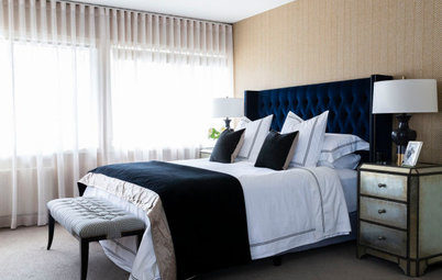
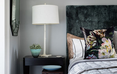
The custom, hand-made wall covering on the bedroom wall.
Most of this renovation was centred around a pale wood floor and a soft, creamy-white palette. The clients then asked that we incorporate some sort of landscape feature into the design. Given the limited amount of natural light the studio receives and the fact the clients only use the space a few times a year, we had to convince the clients to interpret this idea in a slightly different and more abstract way.
The clients’ landscape request was turned into an architectural feature – a play on a canopy bed – in which the fabric canopy is reconsidered as a custom wall covering with green tones that speak to the rich moss and fern colours found in Stanley Park, which is a reference to their home base in Vancouver, Canada.
Find an interior designer near you on Houzz to revamp your home
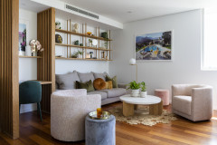
What was your thinking behind the arrangement of furniture and fixtures?
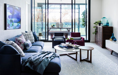
Typically, a sofa is used to anchor a seating arrangement. Here, we used the sofa to do just that and then used lightweight furniture that could be easily moved around to accommodate small or large gatherings.
Typically, a sofa is used to anchor a seating arrangement. Here, we used the sofa to do just that and then used lightweight furniture that could be easily moved around to accommodate small or large gatherings.
The floor plan, after works
As the studio is small, we specified furniture that looked lightweight and that allowed the space to breathe – for example, pieces set on legs that allow you to see the floor beneath them. The dining table, too, is very lightweight and pulls away easily from the wall to accommodate four or five guests for dinner; and the adjustable/extending-arm pendant light reinforces this flexibility as well.
As the studio is small, we specified furniture that looked lightweight and that allowed the space to breathe – for example, pieces set on legs that allow you to see the floor beneath them. The dining table, too, is very lightweight and pulls away easily from the wall to accommodate four or five guests for dinner; and the adjustable/extending-arm pendant light reinforces this flexibility as well.
Why did you choose frosted glass for the bedroom doors?
To allow natural light to filter between the spaces. The bachelors were fine to forgo traditional privacy separation norms.
Were the stairs between the bedroom and living room a challenge?
The change of levels was an existing condition that we had to deal with. In the original layout, the steps extended into the living-room side, which restricted how you could furnish the space. Our idea to absorb the steps into the thickness of the wall was a practical way to allow furniture to sit on either side of the wall and the opening.
Colour palette
Soft whites and pale timber, rich moss/earthy green and brass/bronze accents.
Soft whites and pale timber, rich moss/earthy green and brass/bronze accents.
Why do you think this room works?
Because it works both when the couple is visiting together and when they have to accommodate a larger group gathering.
Flexibility is a key feature here. While the space is small, I’ve heard from the homeowners that they love having larger groups over when people sit on the steps, sofa and dining chairs.
Tell us about the storage under the windows – did you put it in?
Yes. The built-in unit under the two living room windows solved a major problem here: there is an existing steam radiator heater and an air-conditioning unit where the two flush grills are located on the vertical surface. The unit hides them from view.
Yes. The built-in unit under the two living room windows solved a major problem here: there is an existing steam radiator heater and an air-conditioning unit where the two flush grills are located on the vertical surface. The unit hides them from view.
It offers storage too. The remaining space in the unit was repurposed as a television cabinet (with a television-lift mechanism) and a media cabinet for all the television-related peripherals.
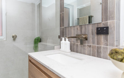
Tell us about the bathroom
Originally, the WC and shower were separate from the vanity area. The new bathroom layout combines these into one unified space.
Browse more crisp white bathrooms on Houzz
Originally, the WC and shower were separate from the vanity area. The new bathroom layout combines these into one unified space.
Browse more crisp white bathrooms on Houzz
Key pieces of furniture/fittings
- Calico Wallpaper wall covering in the bedroom.
- ABC Home Cobble Hill Adams sofa and round rug.
- Hans Wegner GE 290 lounge chair with leather upholstery by Spinneybeck.
- Gubi Pedrera coffee table.
- Poltrona Frau Bob side table.
- Crate & Barrel throw pillows and cashmere blanket.
- Photo above sofa, Horizons by Sze Tsung Leong.
- Vintage dining chairs from JP Denmark.
- Original 1960s dining table, seller located in France.
- Dining pendant from Europe.
- Rove Concepts Asher bed.
- Cedar and Moss Pearl wall sconces.
- Bronte Moon mohair throw.
- Crate & Barrel bedside tables, Patina Bronze drum table and Knurl Accent nesting tables.
- Duravit vanity, sink and toilet in the bathroom.
- Hansgrohe Stark tapware and shower fittings in the bathroom.
- Robern M-Series medicine cabinet.
Materials palette
Your turn
Do you love this clever studio design as much as we do? Tell us your favourite features in the Comments, like this story, save the images and join the conversation.
More
Missed last week’s Room of the Week? Catch up here Room of the Week: Grey and White Done Right in a Bathroom Reno
- LV Wood timber flooring.
- Superior Selected Stone Calacatta Gold slabs on kitchen benchtops and splashbacks.
- International Stone Services terrazzo floor tile in the kitchen, bathroom and walk-in-wardrobe floors.
- Nemo Tile + Stone Metro tiles on shower walls.
Your turn
Do you love this clever studio design as much as we do? Tell us your favourite features in the Comments, like this story, save the images and join the conversation.
More
Missed last week’s Room of the Week? Catch up here Room of the Week: Grey and White Done Right in a Bathroom Reno

Answers by Christopher Kitterman, principal at STADT Architecture
Who lives here: A couple
Location: Manhattan, New York
Purpose of the space: A one-bedroom, one-bathroom studio apartment
Size: 54 square metres
Budget: Approximately AUD$318,000
Brief
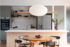
The clients hired us to do a full gut renovation to open up the existing cramped and isolated kitchen to the eastern-facing windows and living area.