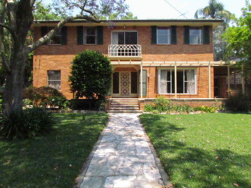
Updated facade to a 1960s home in Warrawee, Sydney.
Architelle Architecture & Interior Design
7 years ago

Featured Answer
Sort by:Oldest
Comments (6)
Related Discussions
Outdated 90s facade and patio area - need inspiration!
Comments (16)Sorry for the delay coming back to you all and thanks for all the input so far! We had our second baby just after posting this so have been distracted since :-) Thanks for all the suggestions and photos I think you are all spot on and I just need to get rid of the terracotta and brown as much as possible. I've got some colour test tins from bunnings so when I can I'm going to try out the following scheme and will post back: Windows - Really not sure? Black/White/Silver? Roof - Monument or Woodland Grey Garage doors - Monument or Woodland Grey Gutters - Monument or Woodland Grey Fascia - Shale grey Eaves/poles - Shale grey Downpipes - Monument or Woodland Grey Driveway/Tiled area - Respray or stencil in some sort of mid grey (the tiles are all cracked anyway). Something like attached. Back paving - Adbri Eurostone in Zurich - http://www.adbrimasonry.com.au/homeowner/paving/see-all-paving/euro-stone - photo attached Couple of questions: Can you paint split face block work and it sticks ok? I didn't think you could if not will render I love exposed aggregate but didn't think you could recoat in this format? It doesn’t seem that common in Sydney compared to Melbourne. Really not sure on window colour and would love some ideas? Other things: Definitely planning on getting an awning once new pavers are down Windows I will get quotes to replace but if too expensive will get a specialist painter for now Zurich is on the right. It's a light grey paver with an exposed aggregate. Available in 400 x 400 and 600 x 400 Cheers, Frank...See MoreUpdate very tired front of house and streetscape
Comments (41)Hi there, I personally don't like the look of that rock wall with your home. It does nothing for it. I would get rid of it, you may even be able to sell the rock for a bit of cash. I would besser block a retaining wall in its place with posts and render this, then use your timber horizontally slated between the posts. Select a paint colour that works nice with your timber colour and carry the colour through to your house. This will also work in with your side timber fence. Also remove all the plants in the front, just because they are lovely doesn't mean they are in the right place or serve a purpose, you may be able to transplant them somewhere else in the yard. Plants: mop tops are a great feature tree and give lots of shade in summer. A hedge along the inside of the fence would look great, Lilly pilly's are good and Japanese box is tough as boots and requires little water once up a bit. Westringia, birds of paradise, hibiscus, viburnum, Murraya all take heat, depends on what look your after. My average temps in summer are 47 degrees and winter -3 & these plants survive. Yes I also agree with a path from the front to the door. Front door to house could have some timber posts added with an awning/patio to make it stand out. The timber would carry through from the front fence. Painting the brick can also give it a lift if you don't want to go modern with render. You could also paint the concrete driveway, there are some snazzy options available for this, plain or stencil. Best of luck! I'm sure it will come up a treat....See MoreLooking for advice on our facade
Comments (21)this is the classic issue with rendering - it needs to be strategically used.....it's a fine line between going too far and then having to put back aspects of what has been lost, which in this case is texture and the horizontal element of brickwork that helps to keeps the facade proportions of these era residences (more) balanced.......now you have to add aspects back in to get that balance back.......it probably would have been better to have taken the brickwork out from above the windows and finished with the dark element insert like the detail you have over the entry further back - then you would have had some architectural consistency and expression of the form.......there's art to understanding what to do and what not to do in these situations which is why we bang on about the importance of seeking professional assistance with these decisions, because it's always cheaper to talk about it all beforehand, rather than try and fix problems that could have been avoided or arguably managed differently/better...... I'd agree that potentially a pergola structure would help bring in some lighter/softer/textural aspect to the frontage, and paint it dark to match the trim/barges - or even some external venetian awnings to the windows - we've sometimes introduces sections of batten cladding or screenings to counter & balance expanses of blandness......one way or the other there's not a cheap way out so perhaps think about what will provide some practical benefit as well so you're getting bang for buck/2 for 1 & not just tarting up to fix aesthetic issues Good Luck! PD :)...See MoreHow do we update our 70s orange-brick Brady Bunch house?
Comments (25)There's some great ideas there . The first thing that stands out is that pipe handrail downstairs -- I hate them with a vengence . Remove it , extend the step to fill the space , with 1 or maybe 2 small full-width steps . Just me , I'd do in charcol or black non-glossy 400 x 400 tiles . Most of the windows are black framed , and look okay in my opinion . Paint the upstairs balistrade in black or charcoal -- will tie it in and even though the style is dated , I don't think it would matter -- it would then look like part of the overall concept . I like the English White of the front door , but here's where I'd get colourful -- do the door jamb and the diamonds in the brightest citrus orange you can , and then carry it to the garage door ! The garage door surround ( including the 3 window surrounds above it ) I would paint in charcoal or black . And here's probably the most controversial part -- leave the awnings , but also paint them in Citrus Orange , with the ridges on them in a beige , maybe veering towards an apricot ! This will really lift everything visually IMO , the orange brick will tie in and bland in without looking overdone , the Bright Orange and mainly charcoal or black is modern but not too modern , with the English White door breaking everything while still having Bright Ornage to tie it all in . There looks to be a Butterscotch Orange gate to the left of the house -- obviously , you would repaint that in the brighter orange too , to look cohesive , but you already see how it looks more exciting than the Burgundy Red existing colours . Which leaves 1 thing I don't like the colour of -- the top fascia board or gutter . I suspect Vitamin C Orange would be too much , so probably play it safe , and go either charcoal , or a lighter greeny/grey to match the roof tiles . Probably not what everyone would do -- but that's what I would do with that pallette !...See More PRO
PROArchitelle Architecture & Interior Design
7 years ago


KK1000