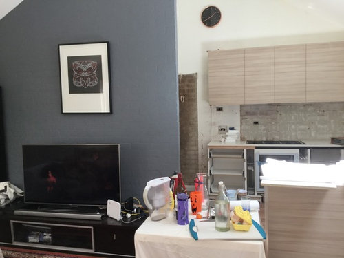
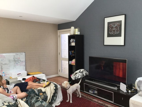
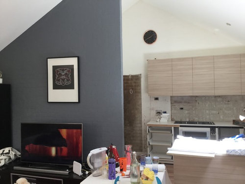
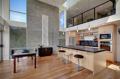
need paint colour help
Danielle New
6 years ago
Featured Answer
Sort by:Oldest
Comments (6)

annb1997
6 years agoRelated Discussions
Help needed for exterior update : render and/or paint, what color?
Comments (16)The grey on the western wall looks dark and purplish on my monitor. It may come over as too imposing and monolithic on the southern face. If you're sticking with the grey palette then a warmer tone would suit the sandstone better. Does Dulux have a colour palette recommendation that includes your Berkshire White plus a grey? Check online or in store pamphlets. But, for such a big, expensive, and impactful paint job I would actually be tempted to get a colour consultant. You're not just repainting a loungeroom wall if it doesn't work!...See MoreNeed help with garden and paint colours
Comments (12)Can you take out one of the garden beds (front left) and do a smaller deck area to transition from the upper deck down to the paving. I think you need a much lighter colour to provide light and contrast with all the tropical plants. Agree yellow and orange are not helping create a relaxing outdoor area. You already have warm colours in the terracotta tile around the pool so a colour for the walls that cools them down, look for neutral tones in lighter blue/greys to reflect the pool. You can see the difference in the photo above which looks much lighter than in your photo with the dark brick and terracotta orange on the walls which just seems to suck the light out. Large pots can be in your favourite pops of colour to great interest and contrast. Good luck with your project....See MoreNeed help with exterior paint colours
Comments (14)Hi Jenna, Have a look at Colorbond Evening Haze instead of Dune. If you go to a Masters store you can pick up The Wattyl Exterior Colour Solagard Brochure. When you open it up on one side of the colour chip centre page you will see the colours Monument, Surfmist and Evening Haze - this is the "Cool" colours side the other side where Dune is placed is the "Warm" colour side. When choosing colours try to stay with cool or warm tones to create a harmonious look....See MoreNeed help identifying a paint colour
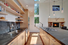
Comments (4)One thing to remember about colours like this. That colour works so nicely there because of the 10ft plus ceilings and all the dark wood and low light in the room. Dark wood furniture and trims swallow colour, low lighting also makes it look warm rather than garish. Paint a similar tone in a well lit room of modern proportions and it's not going to have a similar effect. Rather than trying to match a colour made for a particular room, try and get a similar feel in the room you have. Traditional, high ceiling rooms can take a far more dramatic colour than a modern room can. The scale and detailing make strong colour work in that kind of space. The taubmans red which I think is closest is....Rum Punch. Both have very similar orange hue, similar depth of hue. In the oranges [taubmans] I would pick Cappricio or Orange Flash. In the browns I would pick Fragrant Cloves. The only problem with the colours you have tried is the hue isn't saturated enough. It's tempting to pick a lighter shade of the same tone thinking it will look darker on the wall but that isn't always true. I've painted what I thought were extremely saturated colours on furniture and walls only to discover it wasn't saturated enough. I've just used the paint visualiser with a traditional and dark room and Capriccio seems to come the closest the effect you want out of all those colours. It seems to have that orangey earthy hue with a warm glow you are looking for. For a slightly more vivid colour in near identical range you could also try Orange Vermillion but is just a tiny tweak more saturated....See More
juliahocking
6 years agoTilly
6 years ago PRO
PROCelery. Visualization, Rendering images
6 years agolast modified: 6 years agogirlguides
6 years ago


Dr Retro House Calls