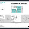
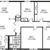
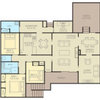
Layout dilemma 70s brick house
jodee7
5 years ago
last modified: 5 years ago


Featured Answer
Sort by:Oldest
Comments (41)

oklouise
5 years agojodee7
5 years agoRelated Discussions
Fake sunken lounge, living areas layout dilemma
Comments (4)Hard to tell how it was constructed without being on site. Any good builder or designer could inspect and advise. I've designed similar but it was due to the slope of the site. The kitchen, living, dining and deck was 3 steps down from the remaining house. It would of had to have extra fill and concrete, etc. so it worked out better. Could be a similar situation here perhaps? Although sunken living areas were very popular years ago...........See Morehow to improve layout of our home (ranch)
Comments (9)Thanks for the reply Claire I think that the fact that you plan to live there a long time warrants a substantial commitment. 1. I don't know if it possible (depend how much you cut into the slope and lower the level - may need to build a bit of a retaining wall) but the first think that I would look at is the possibility of making bedroom 4 into the main bathroom with a separate toilet. This could be on a concrete slab and on the same level as the rest the bedrooms reducing having to do the stair (at night) when members of the household are sick or injured and well located in the middle of the house. 2. I would turn bedroom 1 into an ordinary bedroom and add a new master bedroom with a walk in closet (you may like to have a look at the walk in closest I designed for one of my clients in my Houzz site "Tarneet north QB") and En-suite making use as much of the existing as possible - possibly make use of the area under or extend the carport area roof. 3. I would extend the laundry by using the existing bathroom area and improve store areas that may be lost by as new corridor leading to the new master bedroom. 4. If the kitchen needs too be renovated or rearranged then I would open the area between the lounge, dining, family and kitchen area - this will include the lounge area visually to the main living space.This might give rise to heating and cooling issues which might need to be considered, however for the immediate few years it could make a good study area for the children (retaining supervision from the kitchen) and later be used as a lounge. Please note that these comments are made without any real knowledge of the site such as north point, slope, possible reference to views; both within the site and external to the site, or the geographical position of your house, or the materials used in its construction. These issues may significantly alter the above comments, furthermore you would need to take at least two measurements (say one of the bedrooms overall length and width and ceiling heights) so that the drawing can be scaled into a cad program) to begin the design process - photos of the site would also be needed. I hope this is of some benefit, I would be happy to become further involved with the project, contact could be via email and Skype and PDF documents on an A3 format which is easily printed in any local printing service - Regards Michael....See MoreRoof colour dilemma on 80s brick house
Comments (12)For the patio cover, what about some retractable options? https://budgetawnings.com.au/productImages/Black21_65.jpg http://www.canopy4u.com.au/retractable-awning-patio-cover-folding-arm-grey-5-0m-x-2-5m-motorised.html?gclid=Cj0KEQjw5ti3BRD89aDFnb3SxPcBEiQAssnp0qH9AeIqM_YoaoT0P7Qj-dUwCooEPRoLaA4OH8OQSTAaAhQS8P8HAQ...See MoreBathroom tile layout dilemma
Comments (21)Thanks so much everyone, I am feeling so much better this afternoon. The grout has gone on and they look really good (white grout) and the floor tiles are being laid now - small white mosaics with a soft grey grout. Its coming together really beautifully. I think I just had an image in my head of what it would look like and was kind of shocked when I saw the tiles were laid differently. I just had to adjust my image. I think I will love it. Will definitely hang some plants too. I wish I had heard of glitter grout though! I'll save that for another project :)...See Moreoklouise
5 years agolast modified: 5 years agojodee7
5 years agooklouise
5 years agojodee7
5 years agooklouise
5 years agolast modified: 5 years agojodee7
5 years agodreamer
5 years agoddarroch
5 years agolast modified: 5 years agojodee7
5 years agojodee7
5 years agodanikc
5 years agojodee7
5 years agolizfrew
5 years agodreamer
5 years agojodee7
5 years ago
Andy Pat
5 years agojodee7
5 years agoCaro
5 years ago
Kate
5 years ago PRO
PROJDA Architects
5 years ago
Lynette Ludbrook
5 years agocatpetglen
5 years agolibbyduncan77
5 years agoPeta Wabbit
5 years agoTracey
5 years agomarina
5 years ago
Daryl Silcock
5 years agoCarol Gunn
4 years ago PRO
PROKitchen and Home Sketch Designs
4 years agojodee7
4 years ago- PRO
Kitchen and Home Sketch Designs
4 years ago


Motivo Design Studio