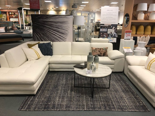
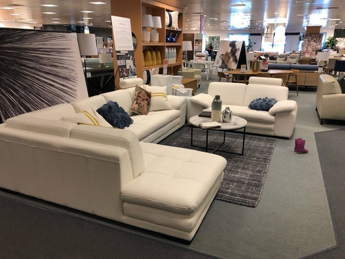
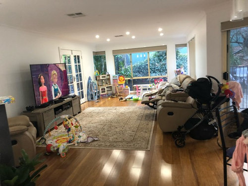
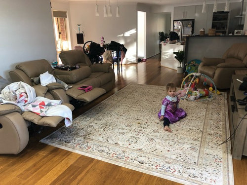
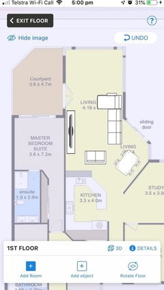
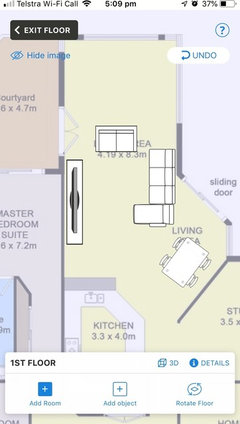
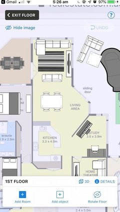
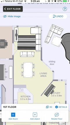
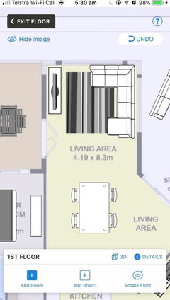
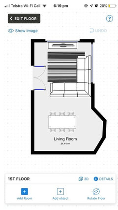
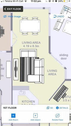
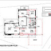
awkward living area - lounge layout
Jessica Standen
4 years ago
Featured Answer
Sort by:Oldest
Comments (20)

Jessica Standen
4 years ago
Kate
4 years agoRelated Discussions
Living area layout disaster
Comments (19)The absolute best position for a dining table is the 6 seater that Jen has positioned in her diagram. Nothing else will ever feel right. You could put a not too deep buffet in that recessed area where the bench seat is now , this will make the space all work as one large dining space....See MoreHelp with furniture distribution for awkward living area
Comments (3)Hi there, Ok what about having only one door into kitchen so you win an extra 800 ish in to that lounge corner, then maybe knock out the nib wall opposite so that traffic comes thru entry into lounge, turns left then right with kitchen straight ahead. Hope that makes sense! I would be putting telly backing main bedroom so lounge is all in that one corner, maximised the area, moved traffic out of it. the far wall could be "rogues gallery" family pix or nice artwork or a narrow piece of furniture for store, display or all of the above!! The lounge furniture can spread into walk ways if you have a crowd scene and need to seat more people but normally would be contained within the one area. Hope that is helpful! Cheers Margot...See MoreLayout for small dining, living area
Comments (46)Hi there, As I see it the problem is common in that there are too many doors in the nearly square space so all the room should be taken with traffic lights! Can the laundry be over with the kitchen? Can the proposed living room have three walls uninterrupted by doors on the north or east (garden) sides? This will give u place to put sitting furniture. Then make kitchen & l'dry on south side as skinny as possible maximising the width of the room for dining table. The other problem that is silly is the garage at the back of the site (It was for keeping the horses away from the house). It is wasting all the drive space. If cars can park at the front of the site it frees a heap of extra space on the south that can be used far better. Kitchen and laundry over by the south boundary, clear space for dining that could open to the existing lounge, area on the north for bedroom creep adding ensuite next to existing bathroom, and living area to the north and east......This helps maximise north light and living too. Hope that makes sense for you! Happy planning, Margot...See MorePlease help with awkward space layout
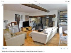
Comments (48)Hi Anna, By now you have likely conquered your space and are happily on to other aspects of your fantastic home. I only came across your post last night and started thinking what would I do if this were my apartment? I would lean into the what is. If it's a dark corner, use the darkness. You know 'use the force Luke'. The contrast with the light-coloured neutral sofa a medium to dark colour for the wall from the entrance will make the space sharper. The sofa will make it look 'light' even though it's not. I wouldn't go with matching pillows to the wall, but I love the cactus at the beginning of the runner which when you are seated on the couch would be a visual break from the entry and bathroom door but no width to touch you as you walk past. I would remove one of the mirrors along that wall and hang the other horizontally about 20 cm above the back of the couch starting from the corner. This way, when seated in the armchair, you are not looking at yourself. I would hang the second mirror on the back of the front door so you can check yourself one last time before leaving, or when coming out of the bathroom. In this example, they have not used a rug to define the living space, but a runner to define the 'corridor' past it, which in your room would be past the bedroom. I would have the armchair just off the runner deeper than the kitchen bench. I would also not put anything in the 'corner nearest the sink as that would be the doorway to the living area and also when you are seated give you a clear sight line to the balcony. For the wall with the aircon, I would put a dramatic piece of art that has the same total volume as the mirror but is square or a fatter rectangle hung vertically so that it sits in the middle of the space between your knees when seated on the couch and your knees if seated on the armchair. That is in the 'coffee table' area whether you have any tables. I started the search with my favourite colour for the wall and then searched graphics for the artwork. But really you should have the art to best match the colour on the wall to one of the lesser dark shades in the art. You can get art made from any print relatively cheaply at Officeworks and use an IKEA frame. Or choose from art printing sites that print to stretched canvas, like this one with postage would be around $300. Hang the art so that the middle of the picture is 150cm above the floor. If you did want a rug to define the space, instead of the corridor past it like in my example, I would choose a single colour that was noticeably darker than the sofa in a shade from the floor and possibly even slightly darker than the floor. Darker than the floors would make the floor look lighter (if that is preferable). You can have any rug cut and edged to any size, including having a rug made from a new length of carpet at all carpet shops. And if this was my place and that was my desk, I would set up in the kitchen facing the balcony to the right of the sliding door. After years of working from home that sense of being on top of the world appeals to me. Thank you for the opportunity to fantasise about living in your space. I hope you are super happy there....See MoreJessica Standen
4 years agoJessica Standen
4 years agoJessica Standen
4 years agoJessica Standen
4 years ago
dreamer
4 years agodreamer
4 years agoJessica Standen
4 years agodreamer
4 years agoJessica Standen
4 years agoJessica Standen
4 years agodreamer
4 years agoJessica Standen
4 years ago
purplekristi
4 years agoJessica Standen
4 years ago
siriuskey
4 years agodreamer
4 years agosiriuskey
4 years ago


dreamer