Architecture
Narrow Homes: Architects Reveal How to Maximise What You've Got
In the second of a two-part series, two architects explain exactly how they made the most of their skinny-site projects

Designing a beautiful and functional home on a skinny block can be a real challenge. “You may only have access to natural light and ventilation at the front and rear of the dwelling, which can influence the design of the building and the location of specific rooms,” says Simon Croft, HIA Executive Director of Building Policy. Narrow homes can be harder to build too. “Access can be a significant challenge for builders, including bringing materials in, scaffolding and storage of materials under construction.”
But as these two architect-designed projects show, a great-looking and functional design is not impossible to achieve. Read on to find out how they did it.
And if you’re looking for more narrow-home advice, check out the first part of this story here.
But as these two architect-designed projects show, a great-looking and functional design is not impossible to achieve. Read on to find out how they did it.
And if you’re looking for more narrow-home advice, check out the first part of this story here.
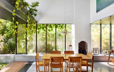
Here, running the polished concrete floor from inside to out creates a seamless sense of flow between the two spaces, making the overall area feel bigger. Fine-framed Vitrocsa steel doors provide less visual bulk than other exterior-door styles, creating clean lines and encouraging the eye to move from inside to out.
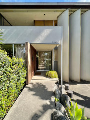
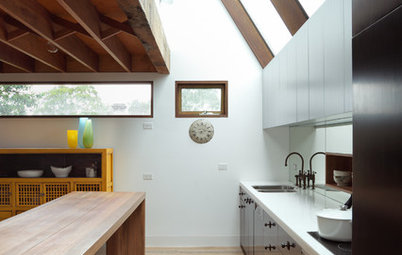
On a site of less than 200 square metres, every centimetre was creatively utilised. Generous proportions were made possible by prioritising and refining key zones.
Through light and height, the space is made to feel calm. The refined material palettes focus on texture, emphasising the character of the old, against the simplicity of the new.
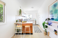
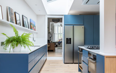
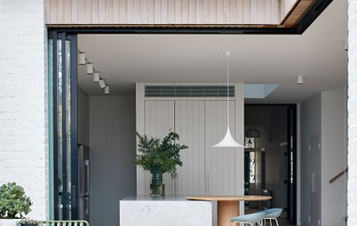
In the kitchen, we used a mirrored splashback to create a sense of additional space.
The dining table was attached to the kitchen bench but set at a lower height to consolidate space, provide seamless access to the courtyard and create better flow.
Light flows down from the glass floor above, making the area feel bright and open.
Not sure how to maximise your skinny site? Have a chat with a local architect on Houzz
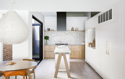
An eye-catching feature can help detract attention from a home’s compact dimensions. Here, heritage regulations meant the fireplace had to be retained. We cleaned up the old bricks and turned it into a dual-purpose focal point in the room. The old fireplace is on the entry side and the new fireplace is on the kitchen side, making for a wonderful juxtaposition between old and new.
A skinny south-facing courtyard delineates the kitchen/dining area from the living at the rear, while making the room feel more spacious. It also provides an opportunity to catch breezes, add planting with a green-wall system and allows the owners to enjoy indoor-outdoor dining.
A skinny south-facing courtyard delineates the kitchen/dining area from the living at the rear, while making the room feel more spacious. It also provides an opportunity to catch breezes, add planting with a green-wall system and allows the owners to enjoy indoor-outdoor dining.
As the house is fairly dark, we added a custom-made, aluminium-framed glass floor and skylights to harness light, which then flows down to the ground floor below it.
We turned a slender, unused space on the first floor into a custom study nook. It is a creative use of a space that might have otherwise been overlooked.
Situated on top of the glass floor, it allows the clients to stay connected with the rest of the house when they’re working from home.
Situated on top of the glass floor, it allows the clients to stay connected with the rest of the house when they’re working from home.
There was no room for a separate laundry, so we tucked a European-style laundry under the stairs. This was also a good way to deal with the potentially ‘dead’ or underused space here.
Bi-fold doors provide full access to the laundry without blocking the stairwell with a full door swing when open.
See more practical and good-looking Australian laundries on Houzz
Bi-fold doors provide full access to the laundry without blocking the stairwell with a full door swing when open.
See more practical and good-looking Australian laundries on Houzz
We specified a larger tile size for the bathroom to add to the illusion of space. Contrasting white tiles on the wall create depth when you look into the space.
The bathroom was landlocked so brought in natural light through a skylight in the ceiling.
The bathroom was landlocked so brought in natural light through a skylight in the ceiling.
2. Commentator: Angus Mackenzie, principal at Angus Mackenzie Architect
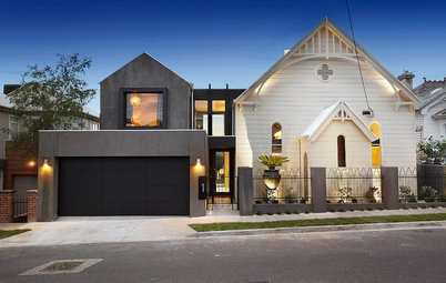
Location: Surry Hills, NSW
Width: Approximately 4.4 metres
Who lives here: A young couple and their two sons
Describe the house: A Victorian terrace
Number of beds and baths: Three bedrooms (plus a study that can double as a fourth bedroom) and two bathrooms
Builder: Studio Constructions
Location: Surry Hills, NSW
Width: Approximately 4.4 metres
Who lives here: A young couple and their two sons
Describe the house: A Victorian terrace
Number of beds and baths: Three bedrooms (plus a study that can double as a fourth bedroom) and two bathrooms
Builder: Studio Constructions
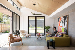
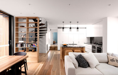
A double-height ceiling in the kitchen and views throughout the entire house and out to the deck make this narrow space appear bigger than it actually is.
It also pulls cross-flow breezes through the house, making it feel naturally cooler.
It also pulls cross-flow breezes through the house, making it feel naturally cooler.
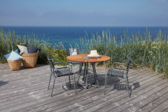
Keeping the floor level even between inside and out helps blur the lines between the interior and exterior, creating the illusion of more space.
We specified the hardwood decking to run east to west in order to make the outdoor area feel wider.
We specified the hardwood decking to run east to west in order to make the outdoor area feel wider.
Roof lights and skylights can be an invaluable technique for bringing natural light into dark and narrow spaces.
Here, we opted to glaze the entire roof of the rear addition to fill the interior with natural light and provide views to the sky above. We added automated external screening to offer a greater degree of heat control.
In addition, the existing first-floor window width was used to ‘slice’ a two-storey opening in the rear wall, where we inserted awning windows and French doors to enhance light and cross-flow ventilation.
We played with space to create the illusion of more volume in this house. For example, we ‘cut out’ large sections of the first floor to create a dramatic double-height space over the kitchen and to allow for a home office.
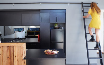
Spiral staircases are fantastic space savers as well. Traditionally, they had a bad reputation for being awkward to use, but these stairs by Enzie are functional and look great. We opted for white with black treads so the staircase would not dominate the space.
We wanted to maximise as much of the roof space as possible in this tall terrace house. The spiral stair leads to two small bedrooms for the owners’ sons, with a traditional gable dormer window to the front and a wider louvred dormer window capturing the rooftops over the city to the rear.
Your turn
Have you navigated a narrow site? Tell us how in the Comments below. And remember to like this story, save the images and join the conversation.
More
Want more narrow-home ideas? Don’t miss these Architects’ Secrets: 4 Genius Design Solutions for Narrow Homes

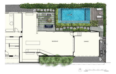
Location: Manly, NSW
Width: 5.18 metres
Who lives here: A couple
Describe the house: A heritage-listed semi on the northern (dark) side of the house
Beds and baths: Three bedrooms and three bathrooms
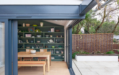
The owners of the two semis decided to renovate at the same time, but with different briefs, budgets and outcomes. The overarching requirement was to preserve the original cottages, but to allow them to evolve through a unique addition to both cottages, honouring the old and celebrating the new.