
Decorating

5 Trend-Setting Colour Palettes for Your Home
And we promise, beige on beige is not one of them ...

When it comes to designing a home, there is no greater challenge than choosing the right interior colour scheme – a palette that reflects the personalities of those living within the space while providing an attractive visual backdrop to their belongings. Trying to rationalise these needs with a desire to create an exciting space that’s in keeping with current trends can leave you feeling overwhelmed before you have even begun! To point you in the right direction, here is a succinct list of five key on-trend palettes for the home and how they could work for you.
This bathroom in Sydney’s Eastern Suburbs hones a relaxed, neutral palette featuring earthy textures by combining timber-look tiles from Amber Tiles with a recycled custom-made timber vanity.
A book-ended marble splashback stunningly showcases the natural characteristics of Calacutta marble. This, set against the timber island benchtop and polished hardwood floors, makes for a refined and relaxed look. The addition of three gold pendant lights above creates a visual balance by drawing the warm golden tones of the floor and benchtop to a higher visual point while providing a luxe highlight.
The hard lines of black steel framework and polished concrete floors are softened by the warm tones of this full-height recycled Tasmanian oak sliding panel or operable wall.
Drawing inspiration from two key palette trends, this contemporary Sydney kitchen combines a strong high contrast black-and-white colour palette with the warming characteristics of natural timber to soften the space. The timber is also used as a subtle reference to the view being framed through the window.
Here, the finishes come together in sleek lines of white cabinetry, streamlined stainless steel and timber benchtops with a complementary timber window frame and lineal slatted light fitting, leading the eye directly to the striking black wall at the far end of the space.
Here, the finishes come together in sleek lines of white cabinetry, streamlined stainless steel and timber benchtops with a complementary timber window frame and lineal slatted light fitting, leading the eye directly to the striking black wall at the far end of the space.
2. High-contrast monochrome
In the divine words of fashion designer Carl Largerfeld: “Black and white always looks modern.” While Lagerfeld was undoubtedly referring to ladies’ fashion at the time, the same rings true when it comes to interior design. Nothing could be more elegant and sophisticated than the simple combination of black and white.
Here, a completely bright white space is anchored by a central black box of concealed storage. Hard-lined black mid-century furniture and lighting create a space of minimal timelessness.
That same sense of timelessness is achieved with the bold use of a bright white and pitch-black colour palette beautifully complementing a contemporary take on a more traditional-style kitchen. Classic beaded timber cabinets are painted in a high-gloss black, blending in to the dark-stained timber floorboards beneath. A black glass splashback and reconstituted stone benchtop in a waterfall-edge profile also help to give this kitchen a subtle contemporary look that won’t date.
Full-height black steel bookshelves are complemented in a stark white room by a black Saarinen end table, black leather armchair and black cow hide on a high-gloss Dalsouple white rubber floor.
A contoured white balustrade leads the eye past a line of black timber veneer paneling to the striking oversized black-framed window beyond. The simple monochromatic colour scheme allows for punches of vibrant greenery from the surrounding gardens to become an integral and refreshing highlight to the interior space.
A white living room in Austin owes its charm to the contrasting black highlighted features throughout. Black insets at the back of the bookshelves create a striking backdrop to the contrasting white cabinetry, while the black recessed down-lights add an element of interest to the ceiling. All the furniture has been specified with black timber detailing and dark navy upholstery. A smart black fireplace creates a dark negative space to its light surrounds.
Black cabinet paint: Benjamin Moore ‘Iron Mountain‘; white cabinet paint: Benjamin Moore ‘Vanilla Milkshake‘.
Black cabinet paint: Benjamin Moore ‘Iron Mountain‘; white cabinet paint: Benjamin Moore ‘Vanilla Milkshake‘.
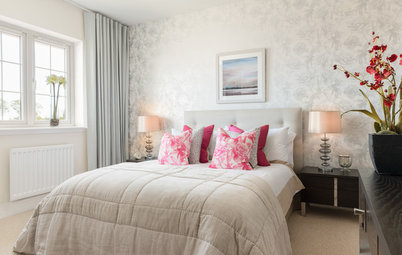
3. White-on-white
A serene white-on-white palette with soft layered finishes creates a calming, elegant look.
In this coastal Sydney home, layer upon layer of warm white tones create a sense of peace and light. The use of mixed textures in the form of subtle patterned rugs, horizontal V-joint wall paneling and soft, sheer S-fold curtains come together in an elegant and inviting way.
The all-white interior of this Scandinavian-inspired home has simply been painted in a white base coat throughout, providing a clean palette for the owner’s quaint organic curiosities and pops of colouful decor to shine.
Drenched in bright natural light, this elegant Sydney living room shows the aesthetic charm of using one paint colour for all the architectural elements of a space. The ornate pressed-metal ceilings and decorative cornices become subtle textured reminders of the room’s past, while matching white plantation shutters subtly serve their purpose in the windows. The whole room is grounded by a dark plush pile carpet with an oversized mirror and glass pendant light adding to the room’s sense of light.
Al fresco living is a pivotal part of this Melbourne home’s character, with interiors that open up completely to the outside. Here, the white-on-white colour palette creates a crisp foreground for the fresh green of the surrounding trees and bright blue of the swimming pool to stand out.
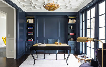
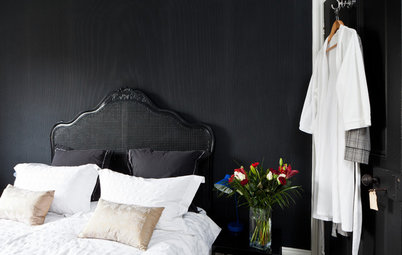
4. Dark and stormy
From the opposite end of the colour spectrum, a palette of moody, dark and stormy colours creates a look of seductive sophistication and ambiance.
The black walls in this home beautifully frame the view through the window, while soft white drapes soften the space.
From the opposite end of the colour spectrum, a palette of moody, dark and stormy colours creates a look of seductive sophistication and ambiance.
The black walls in this home beautifully frame the view through the window, while soft white drapes soften the space.
This New York home packs a punch, with its walls painted in pitch black to provide a striking backdrop for a unique collection of furniture and accessories to be displayed.
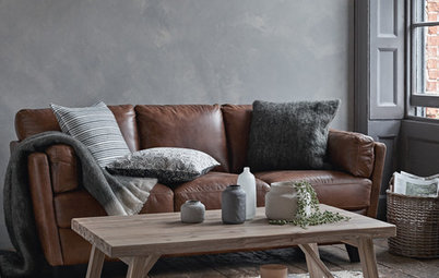
A palette of deep grey makes for a cosy and atmospheric den in this Portland home. The designer chose to upholster the lounge in a plush silk-velvet to match the walls and ceiling. The result is a room of utter comfort and seduction.
Walls: ‘Rainy Afternoon’ by Benjam Moore
Walls: ‘Rainy Afternoon’ by Benjam Moore
Similarly, in this Chicago home-theatre room, the lounge has been upholstered in a rich slate blue velvet to tie in with the dark indigo suede wallpaper – the two soft tactile finishes beautifully complementing each other. The ceilings have been painted a deep charcoal, and heavy black pinstriped curtains hang at full height accentuating the room’s high ceilings.
Wallpaper: Innovations USA
Wallpaper: Innovations USA
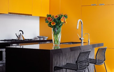
5. Colour-blocking
It’s a bold move, but colour-blocking your home in highly saturated vibrant tones can create a flawless, high-impact look that takes the onus off furniture and accessories to make a space.
This kitchen, for example, would have nowhere near the same charisma were it not for the use of a high-impact orange laminate to the cabinetry. Contrasted beautifully against a black shrouded island bench, this kitchen certainly leaves a lasting impression.
Cabinetry: Laminex in ‘Mandarin’
Designers made a bold move when they decided to paint the far wall of this New England farmhouse. Their bravery paid off with the feature wall becoming the hero of the space, adding a flush of warmth to an otherwise cool industrial space of concrete and white.
Paint: Benjamin Moore ‘Raspberry Blush‘
Paint: Benjamin Moore ‘Raspberry Blush‘
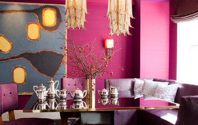
Like a velvet-padded jewellery box, the royal turquoise walls and matching silk drapes of this sitting room act as a lavish lining to an assortment of chic furnishings and accessories with a custom-designed rug in a paintbox of colours reminiscent of a collection of precious gleaming gemstones.
Paint: Wattyl ‘Tropic Turquoise’
Paint: Wattyl ‘Tropic Turquoise’
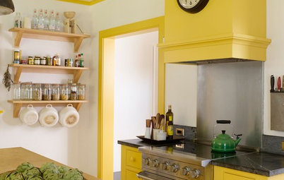
Citrus yellow greets you as you enter this colour-blocked home and leads you into the main living area where a white concrete fireplace is flanked either side by a heady indigo blue wall. The otherwise neutral palette of light bamboo flooring and white walls projects these bursts of colour into the foreground.
Paint: Benjamin Moore ‘Chartreuse’ and ‘Deep Mulberry’
TELL US
Which is your favourite on-trend colour palette from the above? How would you like to bring the colour scheme into your own home? Share your thoughts in the comments section below.
Paint: Benjamin Moore ‘Chartreuse’ and ‘Deep Mulberry’
TELL US
Which is your favourite on-trend colour palette from the above? How would you like to bring the colour scheme into your own home? Share your thoughts in the comments section below.


An emphasis on raw materials and natural textures such as timber and stone add a warmth and organic reference to a space.
In the master bedroom of this Sydney home, raw tallowwood paneling forms a strong focal point behind the bed, bringing a natural warmth and organic charm to the space. The surrounding neutral palette allows for aqua pops of colour to stand out while a natural sea-grass rug from Armadillo and Co adds another organic texture to the space.