Project Of The Week
Architecture
Popular Houzz Series
Popular Houzz Series
Appears in
See also
Fun HouzzFrom The ProsHouzz Around The WorldProject Of The WeekStickybeak Of The WeekQuizzesCreatives At HomeAt Home With...Best Of The WeekRoom Of The WeekDesigner Profiles3 Things I Wish My Clients KnewHow Do I...Buyer's GuidesExpert EyeInnovation AlertSo Your Style Is...Spotted!Picture PerfectBefore & AfterBudget BreakdownHome TimeMade Local
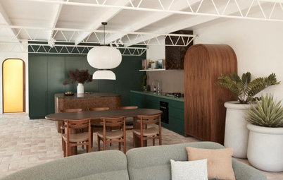
Curvy, Colourful and Compact: Meet the Plaster Fun House
Arches, pink terrazzo and white plaster walls feature in this one-of-a-kind extension to a worker's cottage

In this Q&A series, we turn the spotlight on one thought-provoking renovation or redesign each week. Here, Matiya Marovich, director at Sans-Arc Studio, shares the journey of enlarging a turn-of-the-century, two-bedroom brick cottage with a playful, Art Deco-inspired kitchen extension.
The original kitchen
Describe the original cottage
A single-storey, attached early 1900s worker’s cottage with two bedrooms and one bathroom.
Inspired to get cracking on your own renovation or extension? Find a local architect on Houzz to help make it happen
Describe the original cottage
A single-storey, attached early 1900s worker’s cottage with two bedrooms and one bathroom.
Inspired to get cracking on your own renovation or extension? Find a local architect on Houzz to help make it happen
The architects chose plaster for the interior walls
Gained
Gained
- A 35-square-metre extension to the existing cottage, which opened up the original dining room to a new open-plan kitchen with built-in seating that connects to the garden.
- The original bathroom was doubled in size.
- A new laundry.
The living room before works
What was the starting point for the new design?
The clients’ love of Art Deco and P&O architecture.
What was the starting point for the new design?
The clients’ love of Art Deco and P&O architecture.
The orginal worker’s cottage
What was the brief?
What was the brief?
- A compact space that was fun and full of light.
- A kitchen where the clients could entertain and comfortably keep each company when they’re cooking.
Floor plan of the new addition
What were the clients’ must-haves?
What were the clients’ must-haves?
- Light.
- Colour.
- Display space for their unique Italian and Czech glassware and German pottery, as well as their record player.
Sections of the new addition
The exterior makes a feature of stucco render
What exactly did you do?
What exactly did you do?
- Removed the original lean-to at the back of the house.
- Spliced the existing residence. We integrated the existing dining room into the new extension by running a singular pink terrazzo kitchen island/dining table through the two spaces.
- Enlarged the original bathroom and added a new laundry.
- Introduced a new colour and materials palette, with plastered internal walls and exterior stucco render.
What was the budget?
$230,000.
Where did most of it go?
On joinery for the kitchen, laundry and bathroom.
$230,000.
Where did most of it go?
On joinery for the kitchen, laundry and bathroom.
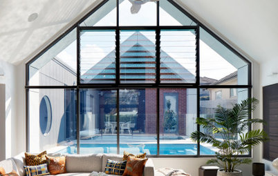
Tell us about the arches
The curves are lively and fun, but they also work to soften the space. When you have a compact footprint, curves make moving through the space smoother – they create a nice flow.
The doorway to the existing house was adjusted to match the arched windows and doors in the new addition.
The curves are lively and fun, but they also work to soften the space. When you have a compact footprint, curves make moving through the space smoother – they create a nice flow.
The doorway to the existing house was adjusted to match the arched windows and doors in the new addition.
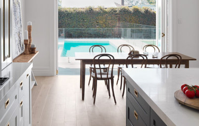
How did you maximise light?
Large windows that frame the views and plenty of white made the space feel bright and breezy.
Large windows that frame the views and plenty of white made the space feel bright and breezy.
What challenges did you face?
Aside from dealing with the project’s small footprint, it was relatively straightforward. Just a super fun job with great clients.
The main challenge was probably connecting the existing with the new and being economic with circulation space – hence the use of a single continuous kitchen island/dining table in pink terrazzo.
Why do you think this renovation and extension work so well?
It’s bold and visually interesting, but it’s still a soothing space you want to be in.
The floor plan is logical and creates a dynamic space that’s perfect for entertaining, cooking and relaxing in.
It’s bold and visually interesting, but it’s still a soothing space you want to be in.
The floor plan is logical and creates a dynamic space that’s perfect for entertaining, cooking and relaxing in.
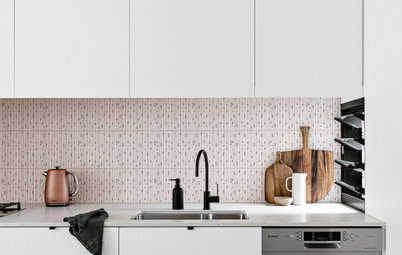
Materials palette
Key pieces of furniture/fittings
Paint colours
Dulux Natural White used inside and out.
- Terrazzo benchtops by Love Concrete.
- Two-pack polyurethane finish to the kitchen cabinetry in Dulux Sea Cliff Half and Feather Boa.
- Two-pack polyurethane finish to the bathroom vanity in Dulux Mystification (see last image).
- VitrA Tiles 50 x 50 millimetre RAL 2406025 tiles to the bathroom.
- VitrA Tiles 50 x 50 millimetre RAL 2407025 tiles to the kitchen splashback.
- New Age Veneers Navurban Ashwood to the built-in kitchen bench seating upholstered in Warwick Fabrics’ Optima polyester/nylon fabric in colour Cactus.
Key pieces of furniture/fittings
- Steel & Smith windows.
- Douglas and Bec lighting.
Paint colours
Dulux Natural White used inside and out.
Your turn
Are you as charmed by this extension as much as we were? Tell us in the Comments below. And don’t forget to save these images, like this story and join the conversation.
More
Want to see more great renovations? Take a look at this story: A Californian Bungalow Comes of Age for a Young Family
Are you as charmed by this extension as much as we were? Tell us in the Comments below. And don’t forget to save these images, like this story and join the conversation.
More
Want to see more great renovations? Take a look at this story: A Californian Bungalow Comes of Age for a Young Family
Answers by Matiya Marovich, director at Sans-Arc Studio
Who lives here: A couple
Location: Torrensville, SA
Size of the original cottage: 110 square metres
Size of the new extension: 35 square metres
Designers: Matiya Marovich, director, and Sam Cooper, architect, both at Sans-Arc Studio
Builder: Build Inc
Landscape design: Pad Studio