Decorating
Deco Ideas That Pay Homage to Dutch Painter Piet Mondrian
These interior and exterior details reference Mondrian's famous composition of red, yellow and blue

Dutch painter Piet Mondrian painted one of the most recognisable, and consequently re-appropriated, images in the world. In the 1930s and early-1940s, he painted a series of compositions consisting of a white background, with a geometric grid of vertical and horizontal black lines filled in with blocks of the primary colours – red, blue and yellow. Yves Saint Laurent transferred the print to a shift dress in 1965; Converse and Nike adapted it to shoes; and Christian Louboutin to wedges. It’s also been used for handbags, swimsuits, tumblers, rugs and wallpaper.
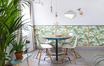
And on the pages of Houzz, Mondrian’s famous composition has been transformed into entrances, atriums, splashbacks, cabinetry, and shelving, demonstrating the beauty and versatility of simple saturated colour in home design. Here are a few design and decoration ideas that directly and indirectly reference Mondrian’s famous compositions.
And on the pages of Houzz, Mondrian’s famous composition has been transformed into entrances, atriums, splashbacks, cabinetry, and shelving, demonstrating the beauty and versatility of simple saturated colour in home design. Here are a few design and decoration ideas that directly and indirectly reference Mondrian’s famous compositions.
Let’s ‘art’ outside. First, something a little different. This playhouse is a prebuilt modular home designed to amuse and entertain children, and to be a standalone object to be admired by art lovers. Directly drawing on Mondrian’s compositions, the playhouse is fun and colourful for kids, and elegant and intriguing for adults.
Although this geometric entrance doesn’t have the pops of primary colour, the structural steel grid is Mondrian-inspired. Interlocking rectangles of textured and frosted glass open the door to an art-filled home.
Interesting interiors. In this warehouse conversion, glazed walls surround a freestanding steel and timber staircase. The translucency of the white panels allow natural light to filter through the atrium, which is punctuated with strong colour accents. These primary colours, white panels and black grid reference Mondrian and add interest and fun to a natural material pallet.
Similarly, the walls become art in this powder room. A grid and colour-block wall playfully express Mondrian, while a circular mirror contrasts the rectilinear lines.
In this designer home, a Mondrian soap dispenser sits on the kitchen bench, while the dining rooms are rendered in the block colours used in Mondrian’s composition. This house is a design-lover’s paradise with the work of famous designers spread throughout.
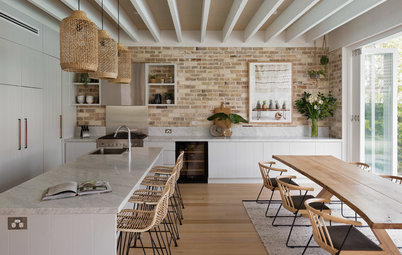
Kitchen capers. A tiled splashback is a fun way to incorporate Mondrian’s composition and can be replicated in small or large tiles (as seen in the following image). It adds colourful interest to an otherwise neutral kitchen, and in this house the modernist theme is repeated throughout the choice of furniture. The owner has the much-desired and revered chairs by Gerrit T. Rietveld, Charles Rennie MacKintosh and Le Corbusier.
This kitchen appropriates Mondrian’s composition in not only the splashback tiles, but also the red benchtop, yellow light shade, and red and blue stools. The window references his grid, as do the white kitchen cabinets edged with black lines. This kitchen is full of character.
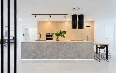
Here is a pared back version of the previous kitchen. And while it does not use Mondrian’s primary colours, the selective use of jewel-toned cabinets mimics Mondrian’s intermittent blocks of colour. It’s family friendly, spacious and light, with accents that are appealing and attractive.
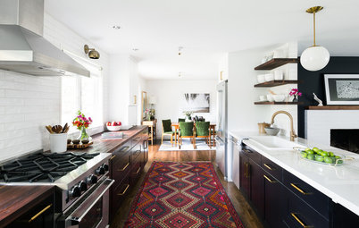
Time in the office. This vibrant and eclectic home office is full of modernist flair. Mondrian’s colourful accents are used in the backing of the bookshelf, the surfaces of the desk and the bright red chair. Furniture is light and moveable, and lines are simple, clean and expressive. This office would be a joy to work in.
Bright and uplifting accurately describe this office. Custom millwork on a wraparound desk and wall cabinets is highlighted with red, blue and yellow – the colours are also echoed in the light shade, rug, chair and desk accessories.
WE’D LOVE TO HEAR FROM YOU…
Do you have a favourite artist or designer whose work you have, or whose design ideas you have adopted, in your home? Tell us in the comments section below and please include some fabulous high-resolution photos.
WE’D LOVE TO HEAR FROM YOU…
Do you have a favourite artist or designer whose work you have, or whose design ideas you have adopted, in your home? Tell us in the comments section below and please include some fabulous high-resolution photos.