Room Of The Week
Popular Houzz Series
Popular Houzz Series
Appears in
See also
Fun HouzzFrom The ProsHouzz Around The WorldProject Of The WeekStickybeak Of The WeekQuizzesCreatives At HomeAt Home With...Best Of The WeekRoom Of The WeekDesigner Profiles3 Things I Wish My Clients KnewHow Do I...Buyer's GuidesExpert EyeInnovation AlertSo Your Style Is...Spotted!Picture PerfectBefore & AfterBudget BreakdownHome TimeMade Local
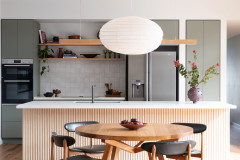
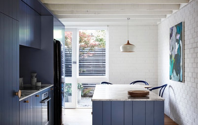
Room of the Week: A Well-Connected Mid-Century Kitchen
A collection of colourful, mid-century glassware inspired the redesign of the family kitchen in this Sydney home

In a Q&A format, we talk to the designers – and examine the creative thinking – behind some of Houzz’s most loveable rooms.
Brief
Our clients asked us to remove the dated, existing kitchen and open the space to the adjoining living area, delivering more light to both the kitchen and living room. They also wanted to incorporate a display area for their collection of handblown glassware, and a kitchen island for casual meals and where the kids could do their homework.
The owners have eclectic taste and wanted the kitchen and display area to have a mid-century feel that matched their furniture and homewares.
Starting point
The owners’ colourful collection of glassware helped steer our design thinking for the kitchen and living room.
We decided to knock down the wall dividing the two spaces and place the shelving at this junction. Glass was chosen for the shelving material as it allows light to flow through.
The owners’ colourful collection of glassware helped steer our design thinking for the kitchen and living room.
We decided to knock down the wall dividing the two spaces and place the shelving at this junction. Glass was chosen for the shelving material as it allows light to flow through.
Key design aspects
Colour palette: Dulux ‘Whisper White’ paint on the kitchen doors and walls; concrete-look porcelain floor tiles; charcoal benchtops and details in lighting and chairs; warm-toned timber; orange and red art, glassware and soft furnishings.
Colour palette: Dulux ‘Whisper White’ paint on the kitchen doors and walls; concrete-look porcelain floor tiles; charcoal benchtops and details in lighting and chairs; warm-toned timber; orange and red art, glassware and soft furnishings.
Materials palette: We used ironbark timber veneer for the cabinetry, Caesarstone benchtops in ‘Sleek Concrete’ for the prep areas, and Caesarstone in ‘Pure White’ for the kitchen island benchtop. The floors were laid with concrete-look porcelain tiles, and we chose stainless-steel taps and a double sink.
A smoked mirror splashback was used to create a sense of openness and help spread the light around – it’s also a little softer and more sophisticated than a regular mirror. Lastly, we chose glass shelving for the display unit so there was an unimpeded sense of flow to the living room.
A smoked mirror splashback was used to create a sense of openness and help spread the light around – it’s also a little softer and more sophisticated than a regular mirror. Lastly, we chose glass shelving for the display unit so there was an unimpeded sense of flow to the living room.
Thinking behind the design
As well as the need for a new display area, there were other elements that influenced the layout here. It was important to make both the kitchen and living room feel balanced, and create a sense of connection between the two, while delivering light into both spaces.
The other major element was the need for a kitchen island. Many homeowners don’t realise island benches take up a lot of space and limit the layout options available. The solution in this instance was to create an L-shaped kitchen.
What challenges did you have to work around?
Working within the confines of the space was challenging. Originally, the owners wanted the curved wall at the rear of the kitchen to be extended and squared off, but after speaking with the builder they discovered this was not feasible. Although it meant a smaller space to design with, the curved wall and windows are interesting features in keeping with the feel of the space.
We also needed to find a way to incorporate the air conditioner and rangehood ducting in such a way that they did not impact the ceiling level. We decided to conceal them both behind a bulkhead above the cabinetry.
Why do you think this room works?
There’s a good balance between the kitchen and living room, with plenty of space and light in both.
The kitchen is modern in style but has mid-century tones that sit well with the homeowners’ furniture and accessories. It would have been a mistake to design a kitchen that was too bold in texture and colour, as this would have competed visually with the other elements in the home.
Tell us
What do you love best about this kitchen? Tell us in the Comments section below. And don’t forget to like, share or bookmark this story – join the conversation.
More
See more ‘Room of the Week’ stories
What do you love best about this kitchen? Tell us in the Comments section below. And don’t forget to like, share or bookmark this story – join the conversation.
More
See more ‘Room of the Week’ stories
Answers by Graeme Metcalf, industrial designer at Dan Kitchens Australia
Kitchen designed by Arthur Baskin, kitchen designer at Dan Kitchens.
Who lives here: A young family and its dogs
Location: Stanmore, NSW
Room size: The combined kitchen and dining area is 6.7 metres wide by 5 metres deep.