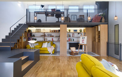
Before & After
USA Before & After: 3 Bathroom Makeovers From Dire to Delightful
See how three USA designers removed bathtubs in these bathroom revamps to create more open, airy and functional spaces

Some homeowners worry about losing resale value when removing a bathtub, especially if it’s the only tub in the house. But for those who rarely use their bath, it can seem like a waste of valuable space. In these bathroom renovations, three designers gained extra space by removing bathtubs and created larger showers, improved accessibility and oodles of storage.
Are you on the fence as to whether your next bathroom renovation should be tub-free? Check out the before and after photos of these three bathroom makeovers that ditched the bathtub before making a decision.
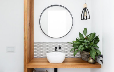
1. Dreamy Open Shower
Bathroom at a Glance
Who lives here: A couple with young children
Location: Charlotte, USA
Size: 15 square metres
Designer: Jena Bula of Delphinium Design
Builder: Ekren Construction
Before: After buying a traditional-style house in Charlotte, North Carolina, this young couple searched Houzz and hired designer Jena Bula to help make their home feel up-to-date with lighter materials and modern lines. For their primary bathroom renovation, this meant ditching a bath they never used and creating a large, open shower.
“The house had a lot of traditional ornamental details and materials that were popular in the early 2000s, when the house was built, and the floors and lighting were yellowish,” says Bula. “My clients wanted to lighten and freshen things up using clean, modern lines and natural materials.”
Ready to renovate your bathing space? Find bathroom designers near you, browse their projects and read reviews from previous clients
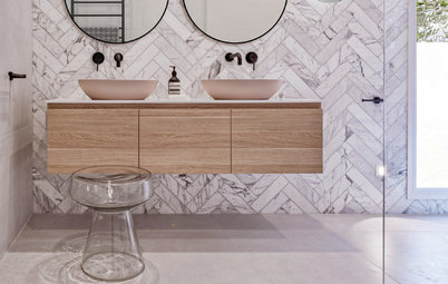
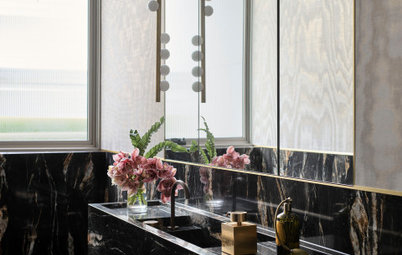
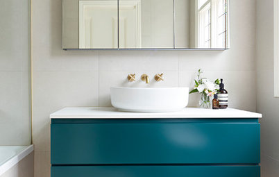
After: Once the tub was removed, Bula had space to create a wet-room area for the shower. The new layout works well with the existing arched window, which already had privacy glass. A 120-centimetre-wide glass panel protects the rest of the bathroom from splashing water. The shower drain is concealed by the mosaic floor tile for an uninterrupted look.
During the initial design consultation with clients, Bula always discusses materials, including the functionality and maintenance requirements of each option. From the inspiration photos the couple had shown her in their Houzz Ideabooks, she could see they were drawn to marble.
The use of natural materials continues in the design of the vanities. Bula custom-designed bleached-white oak cabinets and topped them with quartzite vanity tops. Quartzite is a natural material that has a marble-like look but is harder than marble and more durable.
The use of natural materials continues in the design of the vanities. Bula custom-designed bleached-white oak cabinets and topped them with quartzite vanity tops. Quartzite is a natural material that has a marble-like look but is harder than marble and more durable.
The shower fixtures include a rain showerhead that tilts and a handheld wand. “The handheld wand is useful for cleaning the shower,” says Bula. “And it’s also useful in combination with the bench for ageing in place.”
Bula tweaked the trim around the window, getting rid of some of the more ornate pieces. This was a better fit for her client’s more contemporary tastes. She also specified a mould- and mildew-resistant paint on the trim.
A teak bench in the shower is both stylish and practical. “This is something they can use for ageing in place, but for now they like to place their towels on it,” says Bula. She also added two hooks for towels and robes on the wall opposite the shower heads.
2. Attractive Accessibility
Bathroom at a Glance
Who lives here: A couple
Location: Warrenton, USA
Size: 110 square metres
Designer: Sean Onal, project manager and lead designer at NV Kitchen and Bath
Before: The husband who lives here uses a rollator walker and crutches, so it was necessary for this couple to renovate the existing main bathroom to make it more accessible. The bathroom had a built-in vanity, a bulky bathtub, narrow entrance and kerbed shower stall that made navigating the space extremely difficult.
The couple hired design-build pro Sean Onal to reimagine the bathroom’s layout and update its look. He ditched the shower stall and bulky tub and reconfigured the layout to create a level walk-in shower with a built-in bench and grab bars. Floating sinks and a wider entrance create more space for manoeuvring, while a new white-and-grey colour palette brings a fresh, contemporary feel.
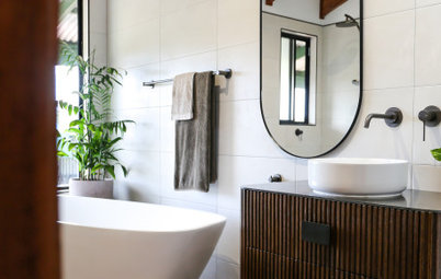
After: Onal devised the new layout with accessibility in mind, placing the expanded walk-in shower on the rear wall, the toilet near a small nib wall and the open floating sinks along the right. “The location of fixtures was important,” he says. “Any user should be able to move around and freely access the fixtures.”
The rear shower wall is covered in large-format 30 x 60-centimetre slate-coloured porcelain tiles. The bathroom’s porcelain floor tiles are the same size in a non-slip white finish, with brown and black veining and grey grout. “They wanted the focus on one of the walls in the shower as an accent wall,” says Onal. “The neutral colours on the floor also make the space feel larger.”
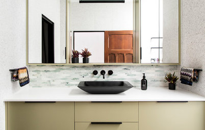
A pair of wall-mounted sinks gives the husband plenty of space below to manoeuvre his walker. The frameless mirrors can tilt as needed. The dark grey floating vanity with marble-look quartz tops contributes to the open look, and cleaning the floor below is quick and easy.
The rear shower wall is covered in large-format 30 x 60-centimetre slate-coloured porcelain tiles. The bathroom’s porcelain floor tiles are the same size in a non-slip white finish, with brown and black veining and grey grout. “They wanted the focus on one of the walls in the shower as an accent wall,” says Onal. “The neutral colours on the floor also make the space feel larger.”
A pair of wall-mounted sinks gives the husband plenty of space below to manoeuvre his walker. The frameless mirrors can tilt as needed. The dark grey floating vanity with marble-look quartz tops contributes to the open look, and cleaning the floor below is quick and easy.
The 213-centimetre-wide walk-in shower was designed for accessibility with its 106-centimetre-wide opening and linear drain between the bathroom and shower floor.
Inside the shower is a built-in bench seat covered in the same tiles used for the side walls. A chrome handheld shower with a slide bar near the bench allows a user to sit and rinse.
The shower floor is covered in slate-coloured 5 x 5-centimetre mosaic tiles that provide contrast and good grip for wet feet.
Browse more bathrooms with grey tiles
The shower floor is covered in slate-coloured 5 x 5-centimetre mosaic tiles that provide contrast and good grip for wet feet.
Browse more bathrooms with grey tiles
3. Mature Makeover
Bathroom at a Glance
Who lives here: A couple with two teenagers
Location: Bridgeport, USA
Size: 8.4 square metres
Designer: Deanne Walczak of 360º Design
Builder: Paul Riccio of Riccio Construction
Before: This Connecticut couple’s teenage daughter, who uses this bathroom, had reached a point where she needed a space with more elbow room, better storage and an updated style that felt more mature. The pink-and-white stripes on the walls were no longer cutting it.
The couple hired designer Deanne Walczak to reimagine the room and steal some extra space from a guest bedroom. She also replaced the shower-tub combo with a low shower and introduced lots of white surfaces to create a more open, airy feel.
Walczak injected character into the room by adding a weathered hardwood shiplap accent wall and brushed brass finishes that bring a bit of bling.
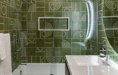
After: The designer knocked the bathroom back to the studs and stole space from the adjoining guest bedroom to add 2.7 square metres, bringing the bathroom’s total floor area up to 8.3 square metres. “That was huge for everything,” says Walczak. “We had a better layout where you don’t have three things – vanity, toilet and shower – in a row. And most importantly, we were able to give her extra storage.”
The extra storage came by way of a new 150-centimetre-long vanity and open cubbies to the right of the shower.
The extra storage came by way of a new 150-centimetre-long vanity and open cubbies to the right of the shower.
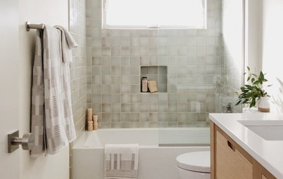
The new shower has a frameless glass enclosure to help create a spacious ambience. The shower walls are covered in white ceramic subway tiles with an accent band of honed marble tiles. The shower floor was tiled with marble mosaics.
A brushed-brass shower column has a rain showerhead and a handheld shower wand. “We chose a showerhead that directs the flow of the water more down than out, so she can turn on the water without getting soaked,” says Walczak.
A brushed-brass shower column has a rain showerhead and a handheld shower wand. “We chose a showerhead that directs the flow of the water more down than out, so she can turn on the water without getting soaked,” says Walczak.
Moving the location of the toilet created room for the new floating vanity. The wall-mounted piece puts more flooring on display, creating the appearance of more space. The white acrylic resin vanity top and glossy white cabinets visually disappear, lending an open and airy feel to the design.
The brass vanity mirror is one of Walczak’s favourite pieces in the new design because it introduced a much-needed round shape to balance all the linear elements. “It’s also just edgy enough for a teenager’s space but didn’t overpower the space with too much brass,” she says.
Your turn
Which of these three bathrooms do you like the most? Share your favourites in the Comments, like this story, save the images for inspiration and join the renovation conversation.
More
Catch another great transformation here with this UK Before & After: A Social Solution for a Slim Galley Kitchen