Need help to choose between two colours??
I live on a rural property in Victoria and building our dream home made of Limestone, a sandy colour for reference to my following question.
I am wanting advice on a colour choice for the eve lining on my veranda. It is 1.8m wide and extends the full perimeter of the home.
Roof colour, spouting, fascias and veranda posts is Colourbond Jasper and aluminium window colour is Stone Beige or almost identical colour in Colourbond, is Paperbark.
I'm thinking that the lining should be light so leaning towards Paperbark but mostly because I have a 4tltr tin of it and it's not cheap stuff ha-ha
However, I would still be happy to go Jasper if most of the posts suggest so, just worried about it ending up a bit dark and gloomy.
Cheers,
Barbara
Comments (54)

mldesign0401
9 years agoBarbara. Your eave lining also known as a soffit is the underside of your verandah or roofline. It is almost always white because it receives NO direct light and reflects any inwards. Painting it a colour is not something I have ever seen nor would I do, particularly on your huge wrap around verandah. Go with your white selection. It is a non feature element of the facade. Especially if the height is a standar 2.4-2.7mtr.
The cost and over shadow of painting a colour on a horizontal plain, above eye level without direct light will not only make you cringe, but will need to be redone.
Dont take risks where they go to waste. Eaves = white shade unless they are a feature gable with period detailing.Barbara Dunstan thanked mldesign0401
Barbara Dunstan
Original Author9 years agolast modified: 9 years ago@Midesign0401,
Thanks for your input, it's always greatly appreciated.
Are you saying don't use the Paperbark either???
That fine if you are saying that, as white is easy to do.
The Paperbark can simply be shelved if need be, as I do want to get it right.
Height is pretty close to the same as the topplate, so 2.4mtrs.
Hubby was just saying earlier today, that the lighter colour might show up insects and their trails and that a dark colour might do better, you know out of sight out of mind, but I simply said I would clean periodically as I already do now and that the lighter colour would be better!!!
Wait till I tell him I'm going white ha-ha
Cheers,
BarbaraRelated Discussions
Need help with choosing colour grey for sitting room
Q
Comments (20)Thanks Helen. Actually I've read that Bristol paints have a record of the formulas used for Benjamin Moore's paints. Not sure if that's accurate though. Also thanks Tilly for all your suggestions. Ironically I used China White throughout an entire house many years ago and I loved it. I also used Whisper White for a lot of the painted shelving and some furniture. It was an open plan house and the colour scheme was seamless. Received lots of compliments. The woodwork in the rest of our current house is in Antique White USA (as are the walls), but I'm wanting to go for a more 'intimate' look in the sitting room, and I'm still drawn to the idea of a warm charcoal grey for the walls, and Antique white USA for the architraves, skirtings etc. I'm attaching a picture of the Benjamin Moore Rockport Gray, but I know it's impossible to choose a colour from a photo, but it will give you an idea of the colour scheme I'm wanting for that room. By the way I know what you mean by the picture rails limiting the use of walls. I'm attaching another photo I've found that shows a similar room (although a lot grander) without picture rails. But my partner is rather fond of the picture rails, and I can just imagine his response if I suggested they be removed! It's hard enough trying to decide on paint :)...See MoreNeed help choosing a colour for a fence
Q
Comments (7)The underside and edges of the concrete balconies in "Ironstone" or "Ticking". If you paint the balcony railings in the same colour or black, they will visually disappear and you will be able to see onto the balconies and inside the apartments. By painting the railings in light colours like white, whitish grey, or a light colour similar to the bricks, the street viewer's sight will be stopped at the railing. This will provide a modicum of privacy on the balconies. For the fence, an orange/ochre will tie-in with the apartment's brick colour. i.e. a warm grey with red or ochre tint in it. The pillar crowns and the capping bricks on the wall in Ironstone/Ticking. Or you could just paint the whole fence in Ironstone or Ticking. If graffiti is an issue in the area, dark colours may attract it. My inner city Perth front courtyard rendered brick fence is a burnt orange and has never been graffitied but the gas meter box which is painted Ironstone always gets targetted. To get an idea of the visual effect of colours, look at the two cars parked out the front. You tend to look "at" the white car on the left (a blocking colour), but you look "through" the dark car on the right and it tends to "disappear" from sight....See MoreI need help choosing kitchen cabinets colour selection
Q
Comments (17)Your kitchen is a good size but not huge so I would go with gloss white to match in with your lovely fridge. All white appliances. Light coloured bench top in the grey range. Backsplash, I'd go to tile expo, choose something you love and add some colour behind the stove, the rest of the splashbacks behind the sink etc in white subway tiles. Dark floors as you have chosen, all the walls in the house Dulux Whisper White. This is a great colour to go with everything, i use it all the time in my designs....See MoreNEED HELP CHOOSING FACADE COLOUR
Q
Comments (5)I'm with oklouise -- do both doors in timber . It won't be too much , but heres what I would do to guarantee that -- the pillar I would do in a lighter coloured stacked stone -- a schist or similar . real or manufactured , but not too 'planned' or even . That brings in the timber and stone and the natural elements , but importantly it has the 2 tones and adds interest . The rest -- It is a bit dependent on roof colour , buts here's a basic idea . Go quite light colour on the main render -- maybe a light surfmist or similar . Then what is mid-grey on the illustrations , go a mid steely blue grey ; that dark panel go a lighter charcoal , unless your roof is a lighter charcoal -- in that case , I'd go a darker charcoal for the contrast ....See Moremldesign0401
9 years agoI am saying white Barbara, I didn't at all mean to sound as insistent as I reads, but I was surprised you were considering the paperbark, which is lovely but it is quite rich, and a deep colour. It is a metameric colour, so it changes it's appearance in different light conditions, and comes off quite muddy in shadow.
If you are open to the occasional pressure clean, then opt for a satin paint, which will not only stand up better to that cleaning, but will reflect more of that precious light for you.
Paperbark for an indoor colour, now that's another promising discussion! LolBarbara Dunstan thanked mldesign0401Barbara Dunstan
Original Author9 years ago@midesign0401,
Hi Megan,
Complete lack of knowledge that using a colour would be incorrect in this instance, that is why your assistance is so vital to me.
You don't know my past but I have only ever been involved in building one other home, my mothers, and I used a very pale green colour for the soffit, as I didn't know otherwise.
It's actually quite an annoying colour now that I think about it but I have never knew why!!!
In fairness to myself, it was 25 years ago and there were no personal computers or Houzz for that matter, so I am quite the novice, albeit that I have some knowledge now but only thanks to you and a few other contributers but especially to HOUZZ for just being there for people like me.
I think you may feel you have been to insistant in your earlier post, not at all, I simply had a tin of Paperbark and though it will come in handy to use there, but again having no idea that it would be a disaster.
Again, I soo appreciate you leading me in the right direction, especially with the suggestion of the satin finish.
This home will be finished just right thanks to your help and I will be forever grateful for that.
I will have to have a sale of unwanted building items I mentioned to hubby just today, once we have finished building and the paperbark can go on this list ha-ha.
Truth of it is, I couldn't decide if I was going to paint the veranda poles either Paperbark or Jasper and Jasper won out.
As for cleaning the soffit, I am quite used to using a pressure cleaner here on the farm, so it won't be hard to give it a spring clean!!
Thanks again Megan, I can't believe how many mistakes I might have made without your guidance!!!
I hope to be your best pupil ha-ha
Cheers,
Barbaramldesign0401
9 years agolast modified: 9 years agoOh Barbara, in no way at all are you a novice, you have project managed that house really, and my opinion is just that, equal to yours. Perhaps I have more generalized experience to base them on, working in this particular field, however never underestimate your own gut instincts!
I do feel eaves look best white, however there are no colour rles, only guides we feel safe to travel between, and if people are reluctant to take risk, or don't have free money to be able to experiment, then these guides make sure you will be reasonably close to getting things right. I feel you give me far too much credit, although I am grateful for having you value my opinion, I would never hope to steer you in any wrong direction.
You know there are colour principles behind a white colour is used on ceilings more often than not, light is really what drives colour, without going on too much about that, white ceilings keep things light and bring above you, the perception of light and space above your head feels lighter, and lifts the space, visually and Figuratively.
At ceiling heights relative to our line of sight, white lifts it, and ceilings above that line of sight, dark colours like deep blacks and browns help to disappear. You can see this in practice next time you visit a New coles or woolworths! In the fruit section mainly, Look up, and note the ceiling colour, it's because they want to contain our focus on ground level! There are real methods for selecting colour for application, a real science behind it. Trust me, dark supermarket ceilings make us spend more, keeping our attention down below, and giving the ceiling the look
of a huge warehouse, other places like target have generally light ceilings, and you can really tell if you look up. The difference is less an issue there, but proves how that black roof can disappear and give a false impression of height.
This can be your homework, if you are my student. Lol.
As for those paint finishes, sometimes more vital than the colour choice themselves.
I imagine you know your way around a gurney!Barbara Dunstan thanked mldesign0401Barbara Dunstan
Original Author9 years agomidesigh0401,
Megan,
Now you give me too much credit Lol
I will most definitely look up when I'm next in safeway or target!!!
White is so easy from my point of view but knowing how important its use is, is something I just accepted but often pondered why it was so, especially when you talk about ceilings.
My mother's ceilings were all the same colour as the walls and although I didn't hate it back then, remember 25 years ago, a lifetime really one could say, but even before your comments of how important white ceilings are, I had already decided to do just that in this new home and I have to admit, my gut instincts took me to that decision and probably reeding and seeing too, just how many well designed homes had them.
Your student will attempt to do you proud, can't ask more of a student but to try!!!Lol
Cheers,
Barbara
Patrice
9 years agoHi Barbara,
Congratulations on building your dream home! How very exciting.I would go for the lighter colour (Paperback) I think in the Aussie heat, having a light colour makes sense.Barbara Dunstan thanked Patrice PRO
PROarchimondo
9 years agoG'day Barbara
Please don't be bullied into painting your verandah ceiling white. I have a theory that white is used on most ceilings because it is easy for painters and people don't have to make a decision.
I have used both these colours in numerous situations. The ceiling in my meals area is painted Jasper and it is a very heavy internal colour (very right for this space), and it is tied in with what was Dulux 'Self-Destruct' on the walls. ( I am not sure that Dulux still have this shade in their range but you can get it mixed at your paint shop.)
I can strongly recommend this type of combination for your ceiling because the 'heavy-beige' of the Self-Destruct will add warmth to area whilst still reflecting a lot of light onto the rooms.
PS. I should admit to a very strong bias against painting ceilings white because you miss out on the opportunity to add some character and feeling to a room for the cost of a tin of paint.
PPS. 4ltrs of paint won't go far over the area you are talking about.Barbara Dunstan thanked archimondo
Cheri
9 years agonice green grass - obviously had a bit of rain in your area?? or perhaps good sprinklers!Barbara Dunstan thanked CheriBarbara Dunstan
Original Author9 years ago@joncox,
Can't remember the time of year this photo was taken but it wood be sprinklers too, if it was summer.
However, living on a rural property allows us our own dam water but this year there wasn't sufficient rain to re-fill the dam, so the lawn doesn't look as good as the photo.
Such is life.
Cheers,
Barbara Barbara Dunstan thanked Kim Westwood
Barbara Dunstan
Original Author9 years ago@archimondo,
I do relate to what you are saying about the use of colour and I had heaps of this in my parents home that I was involved in painting back in the 90's with roofs and walls being all the same colour, no white anywhere, so I appreciate your prospective.
As for the 4ltrs of paint, yes I know it certainly wouldn't have gone far with all the veranda's that I have to do but I was refering to making use of at least the one tin that I had ha-ha
Cheers,
Barbaraladyrob1
9 years agolast modified: 9 years agoHi Barbara, I'm with archimondo all the way on this...I like the Paperbark for many, many, many reasons...which I will not bother to explain, as well as the 'Self Destruct'..(.and the paint mixers can look up the formula and create it for you as was stated.)
White is a cop-out anywhere...everybody's copping out at present..Is that really what you want with your newly discovered delight with colour beginning to rumble in your psyche and getting you excited, or do you want to do something different and better? You could paint it white and then change it if you don't like it or just run out of puff = more expense.
I say pick up on the colours in your sandstone and go for "character and feeling!" That is what a home is all about.and it is an individual choice just like ;feeling;...nobody else can feel for you and ultimately, its your home and you hjave to feel good in it! Its not about a whole lot of sterile choices and what is the proper thing to do or somebody else's preferences...Even the eaves need feeling! I may not be a professional designer or somebody who can write the language and talk tetc... but if I know anything better than most...and almost everyone...yes I dare to say that..... it is colour, and I would challenge anybody to make a liar out of me on that subject.
I am among the " inconspicuous non-cashed up" and that seems to prejudice many pros and amateurs who absolutely rely on the system of which they all are products.....but it matters not. Their loss.
I have given freely of my colour advice and knowledge on Houzz because I love to share what I have discovered, but does anybody give me any credence or dare to try what I suggest? I hope that some of it would fall on fallow ground All I can say is I've put my unique colour knowledge out there for free when in my younger fitter years I earnt my living teaching it to children and adults alike and many are having successful careers because of what they've learnt. I can be proud of that achievement. I've earnt the respect of educational institutions who want my colour knowledge for a teaching text to rival Itten, and that's saying something.They await "The Henderson Text on Colour"
One day I will be taught to all those who are learning about coloiur and how it works and the new wave of designers and artists will take it out into the world...and get paid handsomly for their expertise...That has been my aim.
So, whether you use white or hardly colour or whether you listen to your gut that has been prompting you is all up to you Barbara. I'm done. I am getting old and must get on with my writing.
My manuscript is going to press. Maybe then, in several years when the next wave of graduate artists and colour designers are out there and when the paint range is on the market, people will discover that colour is such a simple thing and such a marvellous thing and wonder what all the anxt was about.
I wish you all the satisfaction in the world with your beautiful HOUZZ into which you've put so much of yourself. What I wish most is that you will listen to yourself on colour and maybe to the most recent person who has been urging you to observe colours in nature and how the light reacts, reflets and refracts with them all..albeit she knows this from observation and from listening to herself! .I do believe she understands the nature of colour...( and cows) and that colour continues to contribute to the richness of life and to her happiness.!
All I can say now is.... listen to yourself and dare to look to see! Everyone has it, its just a question of discovery, and I guess that more than a material thing it is a spiritual thing because it is the Truth...and that is what ennobles and uplifts. I hope your house will inspire you to that! More, I hope that there is a sort of scintillating difference that inspires others and does not reflect what everybody else has.Barbara Dunstan thanked ladyrob1
Kerrie Chapman
9 years agolast modified: 9 years agoHi Barbara. Have you considered Paperbark 1/2 or 1/4 strength? It gives you the contrast and it stays within the colour family you have already.
Our house is Hog Bristle on the walls with Jasper on the roof, gutters and fascias. I think our eaves are Antique White USA or Off White (not 100% sure).
Good luck with your decision and remember, sample pots are a renovator girl's best friend (just a pity they're not free anymore).ladyrob1
9 years agolast modified: 9 years agoJust as a " by the way", Barbara, you say you want to "get it right"...right for whom...and from whose...perspective? Surely it should be yours!
Also...do you really still believe you need to be "lead in the right direction" What direction is that? "Relying on your gut instinct" means relying on what y o u r intuition indicates. .As archimondo says..."don't be bullied... There's much pro-speak I disagree with, its not all absolutely the right thing and some is waffle.
The manufacturers surely would be quickly out of business if they made a colour that reflects a muddy hue. How each colour reflects light depends on its properties and often it takes a really eagle eye to see the colour it does reflect..(.probably something extremely subtle, soft and comforting like sitting in the shade on a hot day.)
Do you remember a former conversation we had about colour influencing one's emotions? Why have such a lovely veranda if not to enjoy feeling serene on it on a boiling hot day by a soft subtle comforting reflection?!
Surely after all you have achieved you have a colour direction all of your own.?
Colour is a combination of chemistry and physics...
I know I said I was done....would not bore anybody any more... but this is what I am currently explaining in my text so thought to drop it in since somebody might find sense in it.
There seems to be a misconception about whether a colour will reflect muddied colour..
The way colours react to light does not depend on the weight of the molecules that make up the pigments,. nor on .what chemicals were used to make the colour.. The properties of the pigments are what make a colour reflect light.. WHAT?
Colours are not metametric, don't care what any text book says! Its incorrect! That's a purely chemical term and colour is more than just chemistry. It relies on physics and believe it or not...it is in our eyes! Each of us sees it differently!
Many different pigments are used to make colours. These may have the same weight per molecule of pigment and the same composition..i.e..made of.plant dyes or of chemicals.... .but...they all have different properties...i.e. they work and act differently when exposed to light.
EXAMPLE - Take two tins of seemingly identical Yellow.. Both may have the same chemical composition and molecular weight but the different chemicals that are used to make similar/almost same Yellow may have different properties. Its the properties that make each Yellow reflect light differently even if, to the naked eye, the two appear exactly the same!
Some people are colour blind! Some see a green as a blue etc,etc.
I tell the children that paint tells lies! No Colour is what it seems.
I give them specific paints made of specific pigments that have been tried and tested and irrefutably produce the mixed colours that are perfect. To prove the point I then give them paints that look exactly the same as the first and ask them to do the same exercise. When it does not work they ..."get it". Notwithstanding though, all the colours that are produced from both sets of paints reflect light....even the muddy browns that occur...they too have certain light reflective properties.
CLUES -
# Be sure to buy the exact same brand of paint and enough to do the whole job..(.The colour may look exactly the same in another brand even after application, but chances are it will reflect light differently where you have used it.)
This happens even with white! Always buy the same one.
White ain't white and Black ain't Black!
# Buy all your paint at the same time, possibly from the same batch number.
# As Kerrie Chapman advises - Use sample pots of different brands and same colour to see which brand gives off the more pleasant reflection of the colour you want to use.
*******************.
With the completion of your home on the horizon...since you are discussing colours...do you want that yellow/orange whirlygig we talked about to keep the flies away from your back door... or was that just a bit of nonsense? I have it on my veranda with all open to the outside..its so hot here.....not a single fly!
As in my favourite Llewis Carrol story..."in that direction lives a March Hare and in the other direction lives A Mad Hatter...you can go to either...the're both mad!" But YOU my dear HOUZZER/ project manager/farmer and all round determined lady should not need to be "led" or even pointed in any direction but the one you choose...Trust yourself! Do you want to relinquish the most exciting and most self-expressive part of your project ?
And ooops! I made a mistake...your house is limestone not sandstone...lov-el-ly!Barbara Dunstan
Original Author9 years ago@ladyrob1,
Robin, thank you so much about caring for my independence, and for the decision to paint a colour to be mine!!!
I can't chat now as I have cattle woes, namely my favoutirt cow Poppit, doesn't want a thing to do with her beutiful heifer calf, so I'm off to the vet for ' potions' to put her into the 'MOOD' for want of a better explanation.
Didn't get to bed till 12.30 am after one cow decided to steal anothers calf and try to injure her own in the process, got that sorted, the thief now accepts her own calf, the the poor little mother trying valiantly to get her calf back it also happy with her precious bundle but now Poppit, not a good start to the calving season, mixing milk at midnight!!!
I will return with my thoughts later today and updates!!!
Cheers,
Barbaramldesign0401
9 years agolast modified: 9 years agoSince there's been so many people willing to suggest any other suggestion but theirs is bullying or a cop out Barbara, I refrain from making any more.
For those other people. White is as much a choice as any, and if you read the previous history on barbaras renovation, it's more than appropriate too. A neutral appreciating person, not scared of risk, but conscious of doing things once!
There is a place for colored ceilings, and I'm sure I've done more than any of the 'white opposers' in my time.
Don't be so hasty to judge peoples suggestions or the confidence of the homeowner for using white. It is not a copout, that's ridiculous.
Sorry to hear about your mama cow and the poor calf! Not to mention poor you. Late night feeds aren't even fun for us humans :). Cows milk is a great looking colour though. Just food for thought. In a more appropriate time...
Barb, you have my contact, I'm no longer willing to be bombarded for making unpopular suggestions, It astounds me that the Approach of some comes across as ' ignore all the other comments, their pointless, go with mine instead' for fear of being rude or worse a bully! There's room for all of us to make a contribution. I hope mine are not interpreted as pushy, superior or out of context with yours or anyone's post. If you're interested, you can ask me direct at any time.
Good luck with it.Barbara Dunstan thanked mldesign0401Barbara Dunstan
Original Author9 years agolast modified: 9 years ago@ladyrob1,
Robin,
Unfortunately midesign has responded before I had a chance to respond first but anyway here goes with what I make of all of this:
Firstly, I am terribly perplexed, as to why you are so verbally angry about the possibility of me taking midesigns suggestion to paint my veranda eve, white???
Midesign has offered her opinion, as have all the other people replying to my forum question.
I believe midesign is a qualified person with design knowlwdge both learned and experienced and I'm sad to think there seemed to be a need to attack one response to such an extent but worst of all, given only one person mentioned using white, it became a personal attack and that is not at all acceptable, after all, I didn't say I would definitely go with white nor did I say I wouldn't.
This forum for me, was about getting a feel about what others would do, if it were their project!!
You say that I should be able to go by my gut instinct and that I shouldn't need anyone elses suggestions, nor should I listen to any one else you say but I have no such instinct with colour at least with art or painting a house.
I admire you for your knowledge and love of art and colours but I have no interest to paint something and then look at it later and say, OMG what was I thinking!!!
Let me tell you how I came to picking Jasper and Paperbark before I go on;
The original roof colour that I had chosen to suit my limestone was Colourbond Headland, a very rusty type browny red that I thought, would compliment the sandstoney colour in the limestone but the colour was discontinued, however, even a little before finding that out, I started to wonder if this very strong colour might date my otherwise modern looking home a colour used more often than not in heritage home designs.
So now, to choose another colour but the truth of it is, that I didn't like a single one so I started to think what colour windows was I going to have and then I'll pick a colour that matches it.
The colour that most matches my bricks is Classic Cream, ghastly, so then there was Paperbark, it would blend with the bricks and not clash so that will simply do, so what colour goes with that, other that black, blue or grey, colours I don't particularly like, well I like black but I wasn't going down that path of having a black roof on a country home, perhaps a city home, anyway, Jasper was the choice because it goes with Paperbark!!!!
No smarts to get to that conclusion, quite frankly I hated Jasper but it worked but I must say, I'm getting more used to it obviously because it's there to stay but my thought process wasn't particularly detailed in any way, no gut feeling just my daughter saying if you're going to use Paperbark then Jasper goes with it!!!
I love colour and wear it OK but I don't want to spend allot of time on the choices and I'm so happy to get a professional and non professional opinion for that matter and I'm not against the opinions in the posts that say go Paperbark or Jasper as the decision is mean't to be mine in the end after analysing everybodies comments.
As for being LED by others as you have intimated, I have quite clearly asked to be LED, I do not feel like I'm relinquishing my rights to have someone else help me, as I don't want to get it wrong and then have to get it right, I want to do this ONCE, I'm not remotely interested in changing the colour every other day let alone the expense involed in doing so and I'm not well travelled enough, nor interested in design and colour to trust myself to get it right either, no matter how much you think I have the ability to do so myself!!!
Being bullied, where did you get such a thought that I was being somehow forced to go with white otherwise something bad might happen???
In fact getting someone else to help me like midesign and you too for that matter, is actually a relief to me and doesn't feel like a loss of personal self expression as you say, or personal enlightenment or similar!!!
Personal attacks have taken what was meant to be a happy event for me, as my first Design Dilemma, to a very negative experience and I don't understand why you felt you had to take and make this personal!!!
It wouldn't have mattered if there had been more than one post advising me to go white.
Well enough said except that I think you owe someone a personal apology and it isn't me!!!
BarbaraBarbara Dunstan
Original Author9 years agolast modified: 9 years ago@midesign0401,
Oh Megan, I am soo sooo sorry that this has happened to you, so wrong and soo uncalled for.
Thankyou for coming to my defence in relation to my neutral appreciation but most of all that I do only want to do this ONCE and I don't want to have or have to get a degree to be sure of getting my colour scheme right, when I can get help form someone like you with your knowledge and experience.
For me, I feel it lifts a huge burden off my shoulders as I would otherwise lose so much sleep and become so anxious trying to get it right.
I have two people in my life trying to steer me, a husband that has about as much knowledge of colour as my cat and a daughter who likes only neutral and her whole home is Hog Bristle, which I always knew was too mundane for me but I had no idea of how to make or stamp this home with "my likes" without getting it wrong.
Now it might be argued that if someone else offers me choices of colours, that the home is no longer "my likes" but that is bunkum, as I will ultimately decide on the shades and the way the colours will come together.
As for the prospect of using white being a copout, I don't even understand where the copout is, as it's simply a colour choice just like someone deciding to use black or any other colour in the spectrum.
White can be quite crisp and clean looking, as many photo's on Houzz can attest when anyone brouses through the thousands of modern kitchens to name just one room in the home.
I'm not personally mad on white, couldn't live with a whole home of white as some people do but I appreciate the personal taste involved in choosing white, or blue or grey and so on and so on...
I do not have your personal email or contact, save making my contact with you personal via Houzz, so you can send me a personal post if need be to confirm best contact.
However,
I would like to say in closing Megan, that I would hope that we, you and I and all the other Houzzers can continue to voice our opinions on future posts without feeling the need to refrain for fear of reprisals or talk of being bullies!!!
Thanks for your kind words too about the cow dilemma, after a quick dash to the vet, I have a small arsenal of injections and a secret potion to hopefully change this cows opinion of her dislike to love of her lovely little heifer calf.
So terrible to see a cow being abusive to their own calf something's got a bit twisted in that head of hers, hormones for sure ha-ha......and I hope after tonight she has a change of heart otherwise, I have several months of bottle feeding.
Kindest regards,
BarbaraBarbara Dunstan
Original Author9 years agoHi Luke,
Yes I did see this picture just recently, probably on Houzz, thanks for the contribution.
Cheers,
BarbaraKerrie Chapman
9 years agolast modified: 9 years agoBarbara, funnily enough I'm not a big fan of Jasper either - but we bought our house already painted in these colours, and I think they did it so the stunningly beautiful (not) bronze security window frames didn't stand out so much. When the house is due to be repainted, I would like to replace Hog Bristle with something like Puddle as it is not quite so "yellow" in the sun, but would still help to camouflage the window frames.
And I, myself, quite like white eaves - it pretty much goes with anything. I suggested a Paperbark dilute for you as I think a soft warm white might suit your colour scheme. However, I think you mentioned somewhere that your house is contemporary (forgive me if I'm wrong). In a modern home I love crisp, clean whites like you'd find in Natural White or Lexicon Half.
I do agree with ladyrob1 in that whatever colour you end up going with, try to buy just one batch as it seems pretty much impossible to match the colour 100% from batch to batch (or if you have to get a second batch, make the two meet somewhere on a part of the house you see least).
Sorry to hear about your cows having family issues. Animals (including bovines) seem to have as many dramas and problems as us. Hope Poppit comes around with her bub.Barbara Dunstan thanked Kerrie Chapman
mandyf21
9 years agoJust had a similar dilemma - painter was here today and painted eaves in three sections for me, one with same colour as fascia (Dune) under eaves, another colour (not as dark but not light) and then final section with the white. The white won - it just let more light into the house and didn't look so dull. Maybe try painting sections yourself and once you re looking at it, you will be know what you like.Barbara Dunstan thanked mandyf21Vickjd Dimitriou
9 years agoThe lighter the better..dark colors absorb heat light colors reflect it..Barbara Dunstan thanked Vickjd DimitriouBarbara Dunstan
Original Author9 years ago@mandyf21,
Thanks for the story, I don't need to try it now do I, as you just did it for me ha-ha.
Cheers,
BarbaraBarbara Dunstan
Original Author9 years agoKerrie,
My daughter used Hog Bristle in her home and because she varnished her skirts and door and had timber flooring, the colour to me looked lemony and yet if you look at a swatch of Hog Bristle is has no yellow in it at all so I'm wondering why it tends to show this unusual tone???
Perhaps the wood reflected the yellow somehow but it certainly turned me off it.
cheers,
BarbaraBarbara Dunstan
Original Author9 years agoUpdate for all and anyone interested, Poppit the cow, has had her veterinary treatment and within 30min her hate did indeed turn to love and she has been left longingly licking her calf as cows do and mumbling little motherly moos to her baby who is a bit bewildered about all of this.
Cheers to all
Barbara
Karin Madgwick
9 years agoWow this has been interesting reading! I have to agree with Megan, as a designer I always recommend white under eaves as it adds to the light play and increases the light coming in through the windows. One other design lesson is that not everything has to be a feature.Barbara Dunstan thanked Karin MadgwickBarbara Dunstan
Original Author9 years ago@Kerrie Chapman,
Just remembered I was going to get back to your last post.
My home style, I'm saying right now seems to be transitional, at least when it comes to the kitchen design.
I have joked in other posts that I call myself an eclectic minimalist.
Eclectic but not in the true sence of the style where for me it seems, that people have allot of things in a room that don't seem to match in colour or style and I mean no disrespect to lovers of this style just an outside and personal view but all of my belongings are second hand and don't match except for the fact that the furniture is real wood and or leather.
The minimalist part, is primarilly because I'm currently squashed into a 7sq home with everything on top of everything and I can't wait to have a home that looks like no one is living in it, like the magazine pictures, that show absolutely nothing anywhere ha-ha
As for your suggestions of interior colours, Lexicon is definitely out for me as it is blue based and I'm not fond of blue but I'm starting to like green, but a darker green or not a lime green but early days yet as to what I'll do, have a look at my ideasbook and you'll see some pictures of green rooms that tickle my fancy and tell me if you like any???
Cheers,
BarbaraKarin Madgwick
9 years agoBarbara, good news about Poppit. In the initial post you mentioned limestone. I am a little confused as to whether you have limestone or sandstone. The difference is that limestone has a blue base and sandstone has a yellow base so this is important when trying to choose colours for the rest of your colour scheme.Barbara Dunstan
Original Author9 years agolast modified: 9 years ago@Karin Madgwick,
I'm sorry but I am just as confused as you, as I was always under the impression that my bricks, purchased from the company in SA called Bruhn, were limestone but they are not white like our daughters limestone bricks purchased from the limestone quarry in Geelong Victoria.
Recently when hubby and I were talking, he mentioned that the bricks he thought, were sandstone, as it is quarried just like limestone but I'm pretty sure it's limestone myself.
Our colour is quite creamy, as I mentioned in an earlier post, not white at all like the daughters, the perfect match is Classic Cream which I detest, so I chose Stone Beige/Paperbark, as it was a more pleasant colour to the eye for me.
I have seen what I think is real sandstone, but I'm not sure and the colours in it are incredible, again if I was right, there were even purples and ochres running through the stone and it didn't seem fake, absolutely beautiful.
I call our stone limestone but it has a very sandy texture and colour, so sorry for the confusion.
Cheers,
Barbara.ladyrob1
9 years agolast modified: 9 years agoHey people all...luv yas and love this open forum that hasn't changed. Not going to argue the point of disagreement as that is all it is. I'm all for everyone getting as many ideas as possible then making up their own minds. and I am very, very adamant about that no matter what professor in whatever book on interior design states otherwise...and that includes me. I am a firm believer, and its been proven over and over, that everyone sees colour differently, there is no right or wrong set of colour combinations...just a way to make them hang together...We each have different emotional reactions to certain colours and combinations and putting aside relativity is a dire necessity in a collaboration. The word 'bullying' was surely meant in best interests...this is not a life and death business, or about personalities but firstly and only about pulling together an amazing HOUZZ!
Its my opinion that white for eaves is a cop out, and I illustrated this point based on a colour choice well made then gradually doubted and dismissed. I found this disappointing. Its not about setting out to offend and its never been personal with me. . I believe that I've been supportive to Houzzers with "colour dilemmas" encouraging each to do what they ultimately see and above all feel is best, makes their inside sing... and that won't change either. If I've seemed angry, I'm not, so apologies to whoever took offence. The written word between people who have never met is often difficult in this respect.
@ Barbara, I've wished you well from the start and still do. In siuch an enormous and courageous undertaking I find it difficult to believe that you are at loss as to how to use colou but.I am sure you are weary. Everyone needs an opinion or two but in the end Its not anybody's house but y o u r s and all I can repeat is that I truly hope it is a reflection off everything you are and that you are forever happy in it.
@ Mydesign, you are a professional and have experience and there are many on Houzz, all of whom have equally as much experience if not more because they are older in years. They too would have personal likes and dislikes and professional trademarks that identify their input in a building or a design or a colour ensemble... the same as the great painters have "their style" that identifies a work as " theirs". I think homes are somewhat in a different category since not personal creations of the designers. I think that designers need to keep this in mind...again just my opinion, nothing more and no hidden inferences. I've enjoyed pleasant exchanges with you on several levels and we have found common ground This will not change, not at my end.. My hope and wish is that the collaboration you two have decided on, on this overwhelming project, brings about suggestions and then all the final personal Houzz-owner- maker-dreamer results that it should.Kerrie Chapman
9 years agolast modified: 9 years agoBarbara, you're right about Hog Bristle being confusing - when our exterior walls are in shade, it is an attractive, light sandy brown, no hint of yellow. But soon as sunlight hits it, it hello yellow! Hubby doesn't know what my problem is. To him Hog Bristle and Puddle look the same and I'm just overcomplicating things. I think he is tonally blind. Funnily enough, I've noticed most men with engineering backgrounds seem to be like this.
I am surprised you find that Lexicon Quarter throws off blue. I've got a swatch here of Lexicon, Lexicon Half and Lexicon Quarter in front of me - Lexicon and Lexicon Half look a little cold but Lexicon Quarter looks almost creamy in comparison. Oh, and it was a suggestion for your eaves, not your interior. Side note: we have used Antique White USA on the inside or our house, and it changes quite a lot throughout the day - most of the time it looks a taupe-based white (which I love), but other times it almost is a pinky-white (don't really love). Amazing how much a colour can alter due to different light.
I can really relate to your current small house situation. When we lived back in Melbourne, we lived in a small 2 br house . It had belonged to my grandparents, so when I moved in I was living with their art deco furniture and belongings, my ugly 80's furniture and belongings, plus my garage was used for storage for my brother (as he had two houses worth of stuff but only one house). Fortunately, when hubby moved in, he had almost nothing to add. Five years ago we sold the house. Hubby, the two cats and I moved to Qld. and 90% of our everything went on Ebay or to an auction house before we left. We bought new, contemporary furniture once we got up here (I wanted modern beach, hubby wanted industrial - we compromised and ended up with a lot of white 2-pac, glass and brushed steel - so I guess that means he mostly won). After our previous house we consciously decided to turf the clutter and go the minimalist route like you want to do. Highly recommend it. Cleaning takes a fraction of the time and the lack of clutter - everything look fresh and tidy. Clutter and lots of knick-knacks are now my sworn enemy.Barbara Dunstan
Original Author9 years agoKerrie,
I know exactly what you mean about the Hog Bristle, certainly looks lemony in my daughters home and whilst I don't dislike a nice bright yellow, the creamy/yellowish glow I see in the daughters home isn't a favourite for me, she has a really good colour tone and is perplexed as to how I see a lemony glow ha-ha
My hubby in comparison to yours, is a mechanic by trade and his brother is a mechanical engineer, anyway, I have exactly the same problem with my hubby when it comes to colour, anything will do for him and I just ask him politely to stick to the building and let me do the decorating ha-ha.
He would quite seriously buy blue tiles if they were cheap and not see anything wrong with puting purple carpet with it, if it were cheap too!!!
I'm always being told I'm an expensive wife and I reply that I can't help it if I'm drawn to quality ha-ha
Lexicon is blue based and I learned this in the paint shop as it is a cool colour but it's not near as obvious in 1/2 and 1/4 strength so I'm steering away from cool colours.
Antique USA also worries me a bit with the pinkish glow, don't worry I have seen it but I was told to try 1/4 strength, needless to say, a pink base is a pink base, not sold on it but I will get help from midesign0401, to make sure the colours go with the rest of the home and that I like them too.
Gosh it's nice to know you understand just how it feels to live in a glorified box, my in laws lived here till they both passed away and all that's left of them is a laminated buffet that I hate!!!
I've told hubby it isn't coming into my home!!!
can't believe neither my parents or my in laws had a sinle stick of decent solid furniture between them!!!.....I lucked out big time!!!!!
I've bought all my furniture for the new home off ebay, all solid timber and I love it all including a redgum table that I only paid $630 for and in the shop I've seen these tables for over $6,000
I actually don't need to de-clutter, I just need a normal sized house ha-ha
I have just a few precious knick knacks and I bought a modern looking display cabinet to keep the cluttery things in one spt behind glass.
Been painting primer on the last 5 veranda poles left to go and they must have at least one top coat before the weekend is over, as the concreting might be getting poured on Monday and also have a fair bit of strapping to go on the trusses over the weekend too.
Picking up the eave lining tomorrow so the painting is going to intensify somewhat!!!
Cheers,
BarbaraKerrie Chapman
9 years agolast modified: 9 years agoBarbara, I call John an engineer as a generic description. He is actually a machinist and also does some CAD, BUT ... he is a former auto electrician! My brother used to be a mechanical engineer and our neighbour builds car parts for the race car industry - and they're all totally oblivious when it comes to colour (John lets me choose colours now and only says something if he really hates it). And as far as any reno goes, they're all like "how hard can it be?" (sometimes, hard, but they can't stand anyone else doing a lesser job and then getting paid for it).
You can't go past good quality timber, I agree. I am not a fan of dark, heavy timber (not for on the beach anyway, but looks lovely in period homes). I would love to have simple scandinavian style furniture, using the lighter, honey-coloured timbers ie. victorian ash or birch. Reminds me of the minimalist 1960's, or the inside of a yacht (love teak too, but who can afford it?).
Never gone through a new build. It must be exciting watching what you've designed in your head slowly become a reality.
Glad Poppit is a happy heifer again. I remember as a kid having to rub down foals with the mare's rug to prevent this (with new mums, anyway).Barbara Dunstan thanked Kerrie Chapmanladyrob1
9 years agolast modified: 9 years agoHere I am sitting on my Queenslander veranda, notebook on knee, on a truly non decent comfy old chair like all the rest of the furniture here, looking at my cracked vinol recliner with the stuffing hanging out with a bit of cat fluff stuck here and there, having suddenly realised that I could be dislexic or that some of the things I've posted about how to see and understand the mistuderstood thing called colour... and how light changes its appearance according to its properties are actually being discussed as old hat knowledge!.
Nothing like the tried and true old hat!
On the other hand,. who is to say that the colour observations being discussed and the idea of retaining personal preferences in favour of what experience dictates is the done thing, was not deliberately relegated to the deep recesses of the psyche for a more propitious time...... when it could be chatted about as ancient literary knowledge! The only problem with that game is that the facts of appropriated knowledge get distorted and it often sounds like dribble.
Be that as it may, and what " may be" being of no huge earth shattering consequence...(unless I allow myself to kid myself that I may have had something to do with this 'sudden knowledge' phenomenon) at least they who once claimed not to understand colour and did not really want to bother, are now chewing it up and having the admiring company swallowi it as if it were original home grown baked beans on toast,...unaware that some of the beans, not being from the original carefully cultivated crop, will cause a lot of embarassing wind.
Oh, its been raining and I have left my footprints in the refreshed earth.
Off to the mud room with me to wash my hands of all this stuff and maybe have a chuckle as I hang my hat on the delapidated old rack in the sureity that it will always keep its shape, will never grow too small for my cranium, will withstand the rigours of tempest, protect me from frustrated blows and from those straws that some like to stick in others' ears to suck out the ideas and so claim them as having come from under their own hats. That's an interesting experience! I know that the good oil of the battered old, not solid mahogany hat rack will preserve what is kept under my hat, and that which has been accumulated in my cranium will always be proven to be intellectual property having originated from under My hat and from under nobody else's ... Ah, life is sweet and secure under one's own time-honoured trusty old hat, and nobody else wears it better than I do.Barbara Dunstan
Original Author9 years ago@Kerrie Chapman,
I laughed about you saying that John is normally only vocal about a colour if he actually hates it ha-ha
I just informed hubby that I'm painting my eaves white and he asked about where is his imput to which I replied, there isn't any ha-ha
He suggested he was going to put up the eaves and then I could paint, no no no I said, that aint happening, I'm painting first and hubby said what about the plastic joiner strips and I said they can stay the white that they already are, simples!!! as the meerkat add says ha-ha.....love that add!!!
Speaking of your love of scandinavian furniture, I don't mind it one bit but hubby doesn't so it will be big and bulky but at least still leather!!
I don't really know exactly what teak looks like, as I've never been on a yacht, don't ever want to either, I get terrible motion sickness and get sea sick just standing on a solid dock watching a boat go up and down in the waves ha-ha.....but I think Teak is also used in expensive cars and if so I've seen that and it's very nice for sure!!!
Yes I am darn proud of what I have achieved having drawn up the plans for my home and now I can walk through the rooms.
Today I've given myself allot of tasks including painting those last five veranda posts and whilst thinking of what was next to do, I missed a post altogether, so out with the paint again, stupid ha-ha
I''m now putting all the strapping on the trusses and veranda rafters, slow process, hitting my fingers occasionally with the hammer, oouuuccchhhh, lucky I wear gloves, doesn't hurt so much.
Hubby, (Haydn) is busy fixing the tractor seat as the backrest collapsed and it so uncomfortable without it.
Between the two of us, we're getting things done.
Best get back to it but have been enjoying the chats.
Cheers,
BarbaraBarbara Dunstan
Original Author9 years agoThank you to all who have given thier opinion and thoughts on my dilemma which ended up with a twist, as I have decided to forgo both the colours that I originally asked about in the forum question and with the help of Midesign0401, I have chosen Whisper White and will begin madly painting over the weekend.
Cheers to all,
Barbarafianou
9 years agoSo how did it all go... I was going to suggest if the colours seem a bit bland to add some big pots of flowers around the verandah... lavender and some hanging baskets of nasturtiums. I think purple and orange would look really nice against your coloursBarbara Dunstan thanked fianouBarbara Dunstan
Original Author9 years agolast modified: 9 years ago@fianou,
Thankyou for your follow up.
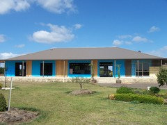
I have in fact painted all the eaves Whisper White as suggested my Midesign0401.
I actually love the colour the more I use it and plan to now paint all the skirts and doors in the house in the same colour and I've just completed the glass brick frames and they look real nice!!
Unfortunately, the eaves are still leaning against the framework inside, albeit painted and ready to go up but we have been wanting to wait for the roof to go on first, which it now finally is, yay!!!
We still have to wait till Xmas until we can afford the rest of the windows before the eaves can actually go up otherwise we would just be providing the blackbirds and swallows somewhere to nest ha-ha
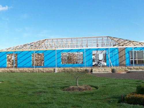
Roof and veranda posts are Colourbond Jasper and I do infact plan to have some plants around the veranda as you suggested but at present they would be in the way as there is still brick work to complete and hubby complains enough already about the garden being a nuisance ha-ha.
I have attached a few progress photo's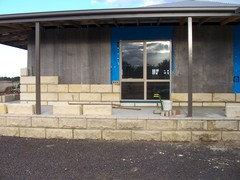
fianou
9 years agoOh wow its really coming along! What a lovely stone brick. I think some hanging baskets with colourful cascading flowers would look lovely around that verandah. Or some mandevillas climbing up the posts.Barbara Dunstan thanked fianouBarbara Dunstan
Original Author9 years ago@fianou,
Thank you for your kind words, I agree it's coming along, although not everyone knows that we've been building this home for 8 years now, using only our own money as humble farmers!!!
We live in a tiny but comfortable7 square, (roughly) relocatable home and I personally can't wait to get into my new home with all the room and room to put everything in it's place!!!
Right now all my posessions are boxed or wraped and in storage in various locations here on the property like our woolshed and an old caravan, as well as things stored in my mother's home a few kms away and with the home having just been sold, means I will have to move this furniture here and add to the mountain of things already in storage!!
I'm sorry to say and hope I don't offend, that I don't have an affinity with hanging pots and plants and hubby would literally "cringe" at the thought of growing a vine up our new posts ha-ha
I have got a pair of large pots either side of the front door , visible in the photo, housing Wisteria's that I hope to be able to keep tamed and they shoud look lovely when in flower.
I originally planned to have about 20 standard roses along the front of the home but they are too much work I've decided and more often than not look quite shabby at certain times, especially when they are dormant, so instead, I have decided to plant several standard grevilleas in a nice stone mulch with a brick border as is the rest of my garden for easy mowing.
I actually have quite a large garden but mulch is definitely the way to go and I have used a few different types of stone mulch, as well as tree mulch and woodchips and this reduces my weeding workload, the bain of all gardeners.
I'm almost 60 and want to enjoy my home and garden but do not want it to become a burden but should I ever consider a hanging basket, perhaps indoors, I will be reminded of you!!! ha-ha
Cheers,
BarbaraBarbara Dunstan
Original Author9 years ago@fianou,
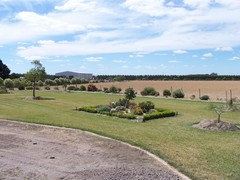
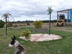
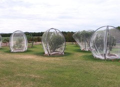
Further to my previous thread, I've attached a few photo's of some of my garden area.
The photo's include a view of my front lawn, my birdbath area still in progress, no birdbath yet, just plants, ha-ha
A photo of our fruit trees which encumbers the entire back yard, about 17 trees and the final photo is one of 5 matched garden beds up our driveway.
Cheers,
Barbarafianou
9 years agoHaha! No hanging baskets then! lol. I never have them either... I never have pot plants because my plants have a better chance of surviving in the ground lol. They're too much fuss for me! I tend to bulbs and things I can just plant and ignore. I've never lived anywhere long enough to really enjoy my gardening efforts though. I always seem to be starting gardens from empty lawn. I saw a picture of my old house and now the garden looks really nice. Good on you for building your dreams and being patient! Its a lovely house!HU-319610855
2 years agoThis is well old now, but what a spectacularly ranty/ passionate thread about eve colour!
Barbara Dunstan
Original Author2 years agoYes it was rather ridiculous, just wanted help not criticism, I went with white by the way and it looks fab!!
Barbara Dunstan
Original Author2 years agoOh thank you, that's Ruby, lost her last Easter, stil cry if I think too much about it. Se was my bestest friend I used to say to her every day during a cuddle.
Time moves on though and I needed another puppy to kiss and love so welcome Gem, nothing like Ruby, destructive OMG but I'm in love ha-ha
She shows affection but sparingly although in the ute she's only millimeters from my face and I often get kisses ha-ha
She's been a mum already and will be again one more time next year.
All pups went to wonderful homes so for now it's just the two of us!!


Sasha G.