
Best of the Week: 25 Kitchens With Colourful Touches
Even the smallest amount of colour has the power to transform a space, as these 25 kitchens beautifully illustrate

If you love the idea of introducing colour to your kitchen, but don’t want to go overboard, look no further. We’ve gathered together a collection of stunning kitchens from around the globe that feature splashes of colour in all the right places – from pretty pastel cabinetry and eye-catching artworks to bold splashbacks. So bookmark your favourites and tell us how you’d like to introduce colour to your kitchen in the Comments below.
Here’s a view into the kitchen. Notice how the armoire on the left is in a similar colourway. Nice touch.
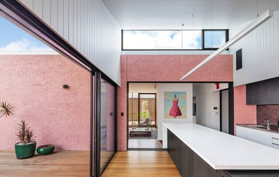
2. Location: Sydney, NSW
Why we love it: It may have been tempting to keep this kitchen all white, but the owner of this Victorian worker’s cottage headed in another direction entirely – using different colours to break up the bulky appearance of the space. We love the insertion of sunny yellow between the more subdued yet closely related shades on the joinery.
Why we love it: It may have been tempting to keep this kitchen all white, but the owner of this Victorian worker’s cottage headed in another direction entirely – using different colours to break up the bulky appearance of the space. We love the insertion of sunny yellow between the more subdued yet closely related shades on the joinery.
3. Location: Sydney, NSW
Why we love it: This is similar to the previous kitchen, but dialled up a notch. We are fans of the pairing of Dulux ‘Goyder Green’ on the island facing and Benjamin Moore ‘Tate Olive’ on the walls. These colours create a snug cottage appeal in a relatively generous kitchen area.
Why we love it: This is similar to the previous kitchen, but dialled up a notch. We are fans of the pairing of Dulux ‘Goyder Green’ on the island facing and Benjamin Moore ‘Tate Olive’ on the walls. These colours create a snug cottage appeal in a relatively generous kitchen area.
5. Location: Denver, USA
Why we love it: Because this space and that wallpaper make us feel happy. Surely that’s the point of all home decoration.
Why we love it: Because this space and that wallpaper make us feel happy. Surely that’s the point of all home decoration.
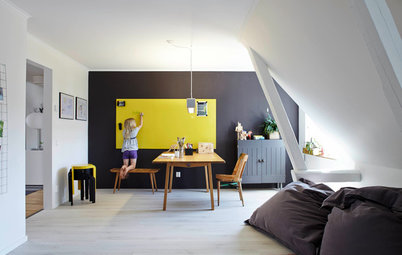
6. Location: Melbourne, Victoria
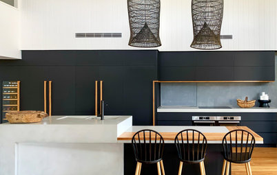
Why we love it: It’s not easy to find a 1970s-style kitchen that doesn’t make you want to hide under a flokati rug. This interpretation, in a glamorous ’70s home in Melbourne by Atticus & Milo, uses colour blocking to such great effect, especially the black, which allows the yellow to pop.
Why we love it: It’s not easy to find a 1970s-style kitchen that doesn’t make you want to hide under a flokati rug. This interpretation, in a glamorous ’70s home in Melbourne by Atticus & Milo, uses colour blocking to such great effect, especially the black, which allows the yellow to pop.
8. Location: London, UK
Why we love it: Another great example of how coloured artwork, in this case in the adjacent dining area, can pair with a subdued colour scheme to energise a space.
Why we love it: Another great example of how coloured artwork, in this case in the adjacent dining area, can pair with a subdued colour scheme to energise a space.
9. Location: San Francisco, USA
Why we love it: Taking your eyes off the pendant for a minute, please admire the beautiful way the timber ‘speaks’ to the green in this mid-century modern kitchen.
Why we love it: Taking your eyes off the pendant for a minute, please admire the beautiful way the timber ‘speaks’ to the green in this mid-century modern kitchen.
10. Location: London, UK
Why we love it: Pops of yellow obvs! The otherwise restrained interior is pepped up by the inclusion of sunshine yellow joinery. We also love how it’s all broken up so it’s easier on the eye.
Why we love it: Pops of yellow obvs! The otherwise restrained interior is pepped up by the inclusion of sunshine yellow joinery. We also love how it’s all broken up so it’s easier on the eye.
11. Location: Melbourne, Victoria
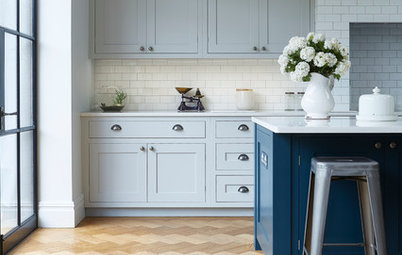
Why we love it: Colour, you don’t need much of it. Here is a beautiful single-colour execution, where a rich navy really anchors the island bench in an otherwise all-white kitchen. Absolutely delightful.
Why we love it: Colour, you don’t need much of it. Here is a beautiful single-colour execution, where a rich navy really anchors the island bench in an otherwise all-white kitchen. Absolutely delightful.
12. Location: London, UK
Why we love it: Here’s another iteration in a kitchen in the UK. Kitchen renovators take note; this is a wonderful way to work colour into your space.
Why we love it: Here’s another iteration in a kitchen in the UK. Kitchen renovators take note; this is a wonderful way to work colour into your space.
13. Location: Manchester, UK
Why we love it: And just in case you wondered what it would look like to go the whole hog colour-wise, we present you with this kitchen in Manchester. We love the fulsome way blue has been embraced, but note the inclusion of a white butler’s sink and brighter accessories to break up the scheme.
Why we love it: And just in case you wondered what it would look like to go the whole hog colour-wise, we present you with this kitchen in Manchester. We love the fulsome way blue has been embraced, but note the inclusion of a white butler’s sink and brighter accessories to break up the scheme.
15. Location: Perth, WA
Why we love it: With all that concrete, the kitchen in this Perth home risked evoking a rather utilitarian feel… until the introduction of sunshine yellow in the overhead cabinets. An inspired choice by the team behind it at Klopper and Davis Architects. We’re also loving how the colour is echoed in the pillar outside.
Why we love it: With all that concrete, the kitchen in this Perth home risked evoking a rather utilitarian feel… until the introduction of sunshine yellow in the overhead cabinets. An inspired choice by the team behind it at Klopper and Davis Architects. We’re also loving how the colour is echoed in the pillar outside.
16. Location: Melbourne, Victoria
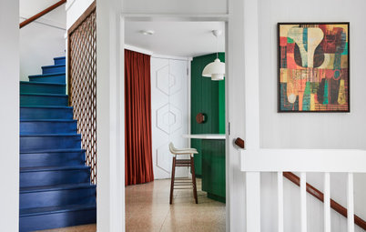
Why we love it: Every room deserves a hero piece that draws the eye and sets the tone for the decorative scheme – including the kitchen. An oversized canvas in deep, dramatic blues might be an unexpected choice for a cooking space, but it works a treat.
Why we love it: Every room deserves a hero piece that draws the eye and sets the tone for the decorative scheme – including the kitchen. An oversized canvas in deep, dramatic blues might be an unexpected choice for a cooking space, but it works a treat.
17. Location: Geelong, Victoria
Why we love it: A bright painted ceiling transforms this simple, pared-back kitchen. We’re blown away by the attention to detail – how the colour spills down to the overhead cabinets and wall tiles, and even flows onto sections of the sliding door frame.
Why we love it: A bright painted ceiling transforms this simple, pared-back kitchen. We’re blown away by the attention to detail – how the colour spills down to the overhead cabinets and wall tiles, and even flows onto sections of the sliding door frame.
18. Location: Bristol, UK
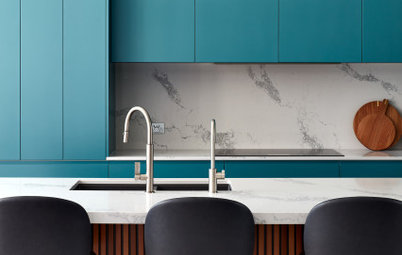
Why we love it: A wonderful example of the power of paint. In this Bristol home, a traditional Shaker-style kitchen is given a contemporary twist with the addition of turquoise on the island unit. We adore how the bright hue is carried through to the cupboard knobs.
Why we love it: A wonderful example of the power of paint. In this Bristol home, a traditional Shaker-style kitchen is given a contemporary twist with the addition of turquoise on the island unit. We adore how the bright hue is carried through to the cupboard knobs.
19. Location: Sydney, NSW
Why we love it: Duck-egg blue subway tiles, which line the wall of this kitchen designed by Cloth + Stone Designs, add subtle interest without overwhelming the scheme.
Why we love it: Duck-egg blue subway tiles, which line the wall of this kitchen designed by Cloth + Stone Designs, add subtle interest without overwhelming the scheme.
20. Location: Adelaide, SA
Why we love it: Timber and tangerine – a match made in style heaven.
Why we love it: Timber and tangerine – a match made in style heaven.
21. Location: London, UK
Why we love it: Proof that you don’t need lashings of colour to create impact – tiny touches of yellow in the handle detail create a fresh, fun vibe in the kitchen of this family home.
Why we love it: Proof that you don’t need lashings of colour to create impact – tiny touches of yellow in the handle detail create a fresh, fun vibe in the kitchen of this family home.
22. Location: Bristol, UK
Why we love it: Lining the splashbacks with fish scale tiles in navy, yellow and white is the perfect way to unify the scheme in the large, airy kitchen.
Why we love it: Lining the splashbacks with fish scale tiles in navy, yellow and white is the perfect way to unify the scheme in the large, airy kitchen.
23. Location: Sydney, NSW
Why we love it: The burnt-orange bar stools pop against the dark-toned cabinetry in this Sydney kitchen. A sophisticated look, and one that’s easy to update down the track should the owners wish to do so.
Why we love it: The burnt-orange bar stools pop against the dark-toned cabinetry in this Sydney kitchen. A sophisticated look, and one that’s easy to update down the track should the owners wish to do so.
24. Location: London, UK
Why we love it: Dark grey and egg-yolk yellow prove an appealing combination in this London kitchen. We’re smitten with how the owners have carried the cheery shade through to the shelving nooks.
Why we love it: Dark grey and egg-yolk yellow prove an appealing combination in this London kitchen. We’re smitten with how the owners have carried the cheery shade through to the shelving nooks.
25. Location: Manly Vale, NSW
Why we love it: A tranquil palette of soft blue, white and touches of timber sets the perfect tone for a beachside home.
Tell us
Have you introduced colour to your kitchen, or would you like to? Tell us in the Comments below. And while you’re at it, don’t forget to like, share or bookmark this story – join the conversation.
More
Read more Best of the Week stories


Sponsored

Sponsored
Why we love it: It’s not often a kitchen looks like a calming, serene place, but this sea-foam green is absolutely charming. So too are its cut-out drawer pulls with glimpses through to unstained timber.