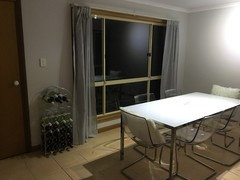
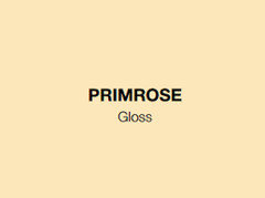
Best creamy white/light cream paint to match primrose hue colourbond?
Skye Ali
7 years ago
last modified: 7 years ago
Featured Answer
Sort by:Oldest
Comments (30)

Tribbletrouble44152k7 Trek
7 years ago
Skye Ali
7 years agoRelated Discussions
Bedroom blind selection - please help :(
Comments (14)A couple of things from me. Firstly, the cornice painted a yellow makes the ceilings feel lower than necessary, paint them out white or as per tour ceiling rather than accentuate the highest perimeter moulding, you don't want yo draw attention to the highest detail not being high! Secondly, to make the room feel fully addressed the window has to be looked at in context of your room. The house style is important, but more so the room space and light. As you have a verandah you probably have in direct sunlight, but the room is not large, so i would try to make the window feel part of the bigger picture rather than contrast with it. Which is what the red does, effectively looks like a red rectangle dominating a small wall. Do the opposite, taking colour cues from the room will make it feel unified, therefore bigger. The caramel carpet, for me is where I would draw upwards from. I suggest a rattan roman blind, the texture and stiffness will resolve that terrible sag, let in diffused light and provide a natural element needed in country style schemes. It allows the scenery to stand out, and colour is easily built upon it. If you need further blackout, you can install a uv cheap roller blind within the window frame, which would be hidden from view by the roman blind, so it can remain up most times and the roman can frame the beautiful view, allow light and then use the roller as your night privacy blackout blind. Most Romans look best as a frame treatment, they dress the window better than they function on them. Shutters would also be stunning with their play and filtering of light, but costly. And just a tip, your bed would feel far more luxurious in that space if it were not heavy in colour, the metal and timber, both which are not genuine as in fake cast iron and artificially stained orange pine date your space, that is not a dig, just an observation. You could do an upholstered bedhead for a luxurious look that a linen would tie in with the soft furnishings, you can address colour in many ways, but the blinds, carpet and bedhead should be neutral unless you can afford to upgrade often?.. A layering of texture and tones rather than colour is far softer in a country space, that's why it's done often, creamy whites on a caramel carpet will really brighten and freshen that space, , timber lamp bases, fabric shades, plush pillows and personality pieces, you'll have a space you can't wait to get to. I hope this was helpful!...See MoreWhich white do you like better?!
Comments (75)Hi there, having recently been through a similar decision process for our Reno I can really recommend ordering the Dulux A4 samples. They are made with the real paint on them so you can move them around from room to room to see exactly what it will look like without having a heap of swatches painted on the wall. They have a sticker backing but I used blu-tac so 8 could move them over and over. Good luck...See MoreHELP! Choosing "white" paint for walls.
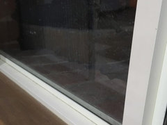
Comments (35)I had the same problem too. I rang Dulux and had a paint consultant come in. I have chosen the white exchange full strength throughout the double story house as we have a lot of natural light with vivd white ceilings and WA white doors and trims. The bedrooms I have 1/2 strength white exchange with vivd white ceilings. I wanted my white kitchen to pop with the wall paint colour. Our kitchen cupboards are polar silk white with moose silk contrasting and ice snow bench tops. Hopefully it all blends with the spotted gum floorboards. We have not installed the kitchen yet. I hope it all comes together. Good luck....See MorePrimrose window frames and charcoal grey floor tiles
Comments (9)Hi Donna. I’m asking myself that same question; trying to work out if it will really matter, and if I do decide to paint the outside, where do I stop? And will I be creating a maintenance nightmare in years to come. It’s not immediately obvious that the internal and external parts are different colours. I notice. Others don’t. You can see the diff when you’re at an angle, but you have to be looking for it. And who stares at your window frames? People are usually looking outside, beyond the frame. Excuse the mess and half finished paint job, but these pics may give you an idea of what to expect. It’s more obvious on the sliding door, but only when close up and from an acute angle. This will look dramatically better when I finish painting the door frame....See MoreSkye Ali
7 years agoSkye Ali
7 years agoSkye Ali
7 years agoSkye Ali
7 years ago
KK1000
7 years ago
robandlyn
7 years agoTribbletrouble44152k7 Trek
7 years agolast modified: 7 years ago
Mira Lukan
7 years agorobandlyn
7 years agoSkye Ali
7 years agoSkye Ali
7 years agoTribbletrouble44152k7 Trek
7 years agolast modified: 7 years agoSkye Ali
7 years agoSkye Ali
7 years agoTribbletrouble44152k7 Trek
7 years agoTribbletrouble44152k7 Trek
7 years agolast modified: 7 years agoTribbletrouble44152k7 Trek
7 years agolast modified: 7 years agoTribbletrouble44152k7 Trek
7 years ago PRO
PROCordony Group
7 years agolynis48
5 years agoSomuchpaint
3 years agoUser
3 years agoLisa Brady
2 years agoKirsty Waight
2 years agoLisa Brady
2 years agoanothersimpson
7 months ago


Sponsored


Skye AliOriginal Author