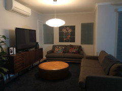
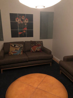
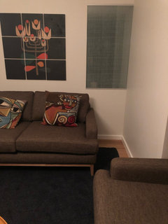
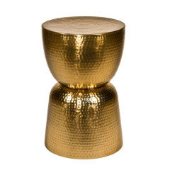
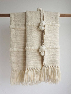
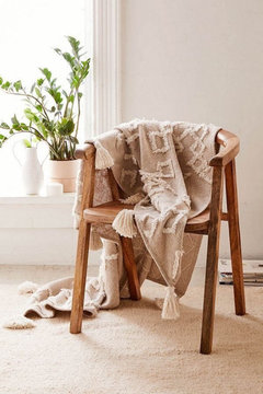
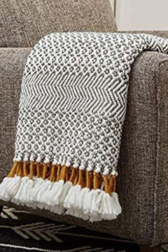
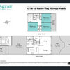
ideas to fill an awkward corner
Amber
4 years ago
Featured Answer
Sort by:Oldest
Comments (14)
 PRO
PRODr Retro House Calls
4 years ago
Amber
4 years agoRelated Discussions
Filling an awkward space in front lounge room - HELP!
Comments (16)if the alcove doesn't suit your style it should be relatively easy (subject to load bearing) to remove the nib walls and create more flexibility for furniture arrangement...a carpenter, handyman and/or plasterer should be able to give you a quote...See Moreawkward living area - lounge layout
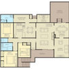
Comments (20)Sorry but I am confused by the purpose and function of this entire space. Form follows function.... But I am not seeing the function being clear so that is causing the problem with the design. Your layout and comments imply that: someone is playing piano, someone is watching movie in theatre room, someone is playing with toys, someone is watching huge TV in living area, someone is cooking.... All at the same time. If so, then these needs will dictate the design... Or whatever your specific needs are. I would start by defining function priorities (storage, view, access, etc) and then work from there ~ prioritise these functions and estimate boundaries/size to define zones that are needed. Have another plan of things that cannot be changed easily - windows, kitchen, powerpoints - with dimensions from reference point. Ask questions like: how often will we/I use this _ do we really need separate piano room_ do we need to use French doors daily _ do I want to walk past new lounge suite carrying food _why would iI use both theatre room and living room at same time _ do I need all these windows or can I fill in one to get more function in the space _ Good luck as you will have to balance needs and wants!...See MorePlease help with awkward space layout
Comments (48)Hi Anna, By now you have likely conquered your space and are happily on to other aspects of your fantastic home. I only came across your post last night and started thinking what would I do if this were my apartment? I would lean into the what is. If it's a dark corner, use the darkness. You know 'use the force Luke'. The contrast with the light-coloured neutral sofa a medium to dark colour for the wall from the entrance will make the space sharper. The sofa will make it look 'light' even though it's not. I wouldn't go with matching pillows to the wall, but I love the cactus at the beginning of the runner which when you are seated on the couch would be a visual break from the entry and bathroom door but no width to touch you as you walk past. I would remove one of the mirrors along that wall and hang the other horizontally about 20 cm above the back of the couch starting from the corner. This way, when seated in the armchair, you are not looking at yourself. I would hang the second mirror on the back of the front door so you can check yourself one last time before leaving, or when coming out of the bathroom. In this example, they have not used a rug to define the living space, but a runner to define the 'corridor' past it, which in your room would be past the bedroom. I would have the armchair just off the runner deeper than the kitchen bench. I would also not put anything in the 'corner nearest the sink as that would be the doorway to the living area and also when you are seated give you a clear sight line to the balcony. For the wall with the aircon, I would put a dramatic piece of art that has the same total volume as the mirror but is square or a fatter rectangle hung vertically so that it sits in the middle of the space between your knees when seated on the couch and your knees if seated on the armchair. That is in the 'coffee table' area whether you have any tables. I started the search with my favourite colour for the wall and then searched graphics for the artwork. But really you should have the art to best match the colour on the wall to one of the lesser dark shades in the art. You can get art made from any print relatively cheaply at Officeworks and use an IKEA frame. Or choose from art printing sites that print to stretched canvas, like this one with postage would be around $300. Hang the art so that the middle of the picture is 150cm above the floor. If you did want a rug to define the space, instead of the corridor past it like in my example, I would choose a single colour that was noticeably darker than the sofa in a shade from the floor and possibly even slightly darker than the floor. Darker than the floors would make the floor look lighter (if that is preferable). You can have any rug cut and edged to any size, including having a rug made from a new length of carpet at all carpet shops. And if this was my place and that was my desk, I would set up in the kitchen facing the balcony to the right of the sliding door. After years of working from home that sense of being on top of the world appeals to me. Thank you for the opportunity to fantasise about living in your space. I hope you are super happy there....See MoreIs this an awkward idea?
Comments (13)The fridge looks too wide for the cupboard , so I assume you have measured it ? Apart from that , do you only drink chilled wines ( whites ) ? Personally , I like to show off the bottles , mainly the labels and bottle colours etc , rather than hide them -- not being a snob , as theres some interesting labels and colours across the whole price spectrum . Thats why I have a 'stand-up' arrangement in a glass door fridge and then reds and spirit bottles on shelves , in diamonds , even stacked up a piece of wood with holes the size of a bottle neck drilled in it ( sort of the reverse of one of Julie Herberts inspo pics ) . But its your place , your taste , and you have the fridge , so use it however suits you ....See MoreAmber
4 years ago- PRO
Dr Retro House Calls
4 years ago Amber
4 years ago
Kate
4 years ago
siriuskey
4 years agosiriuskey
4 years ago PRO
PROLauren Shiels Interior Design
4 years agosiriuskey
4 years agoAmber
4 years ago
julie herbert
4 years agojulie herbert
4 years ago


Sponsored

julie herbert